Can We Guess Why you Selected Something in a Scatterplot?


Selections are a key interaction in data visualization. They are used for highlighting and as the starting point for subsequent actions, including filters, group assignments, etc. Capturing the intent – WHY were these items selected? – can be used to help users refine their selections and to keep a meaningful history of the analysis process. This post discusses our paper on techniques to capture such intents.
For the publication, and prototype for predicting intent techniques, please see Predicting Intent Behind Selections in Scatterplot Visualizations.
Selections are the bread and butter of interacting with data visualizations. On their own, selections are used for highlighting a subset of data, but they form the basis for other downstream actions like filters, aggregation, categorization, annotating or labeling, etc.
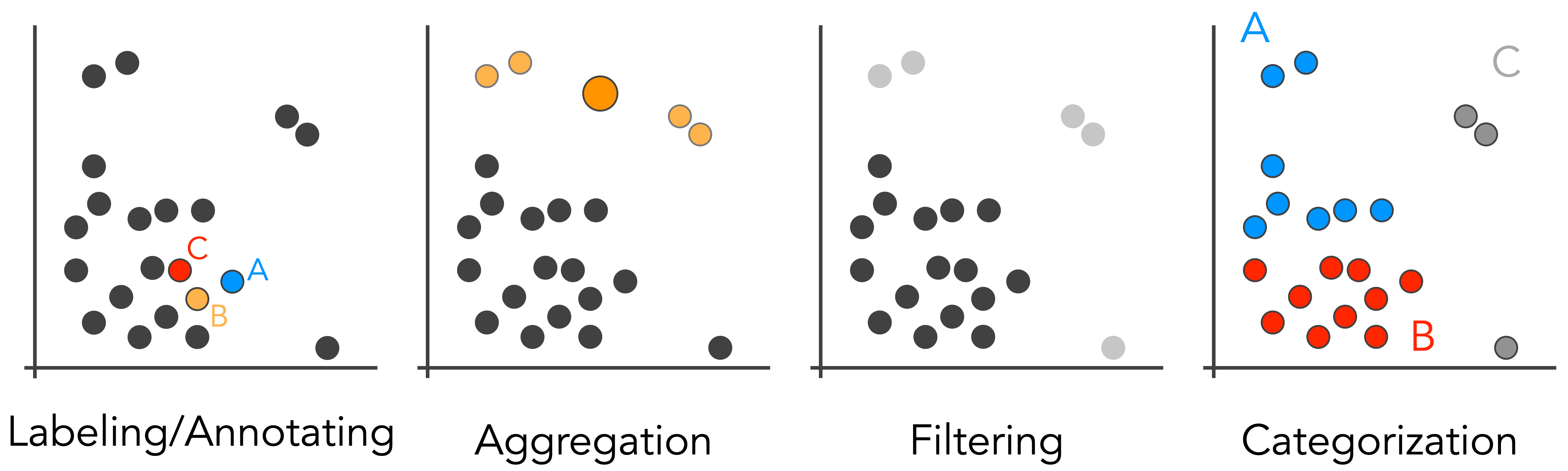 Examples of operations that can be performed based on a selection in a scatterplot: Annotation or labeling of individual data points; aggregation, i.e., grouping multiple points; filtering points; and categorization of groups of points.
Behind the scenes, selections are usually captured as a list of identifiers of the elements selected. Sometimes, selections are based on geometric brushes, such as rectangular brushes in 2D or brushes along the axis in 1D. These brushes can be captured based on the “size” or the extent of the brushes.
In either case, the selections captured do not provide much information about an analyst’s intent behind the selections. So, is there anything we can do to understand the intent – the semantics – of a selection?
What is Semantic Selection?
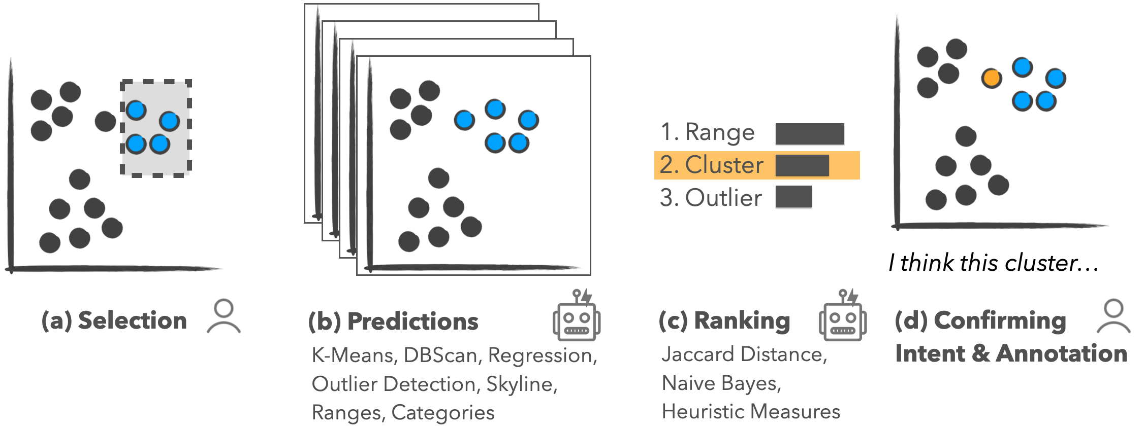
The intent behind an action in data visualization is formed at multiple levels. Analysts typically have high-level analysis goals, like trying to reason about the effect of government policies on Covid-19. Such high-level goals are typically broken down into smaller units in data analysis, such as choosing a visual encoding or selecting outliers to remove them. Here we will focus on one class of lower-level intents, which we call pattern-based intents for selections.
In our paper, we define pattern-based intents as “the reason behind selections based on statistical patterns or structures in the data.”
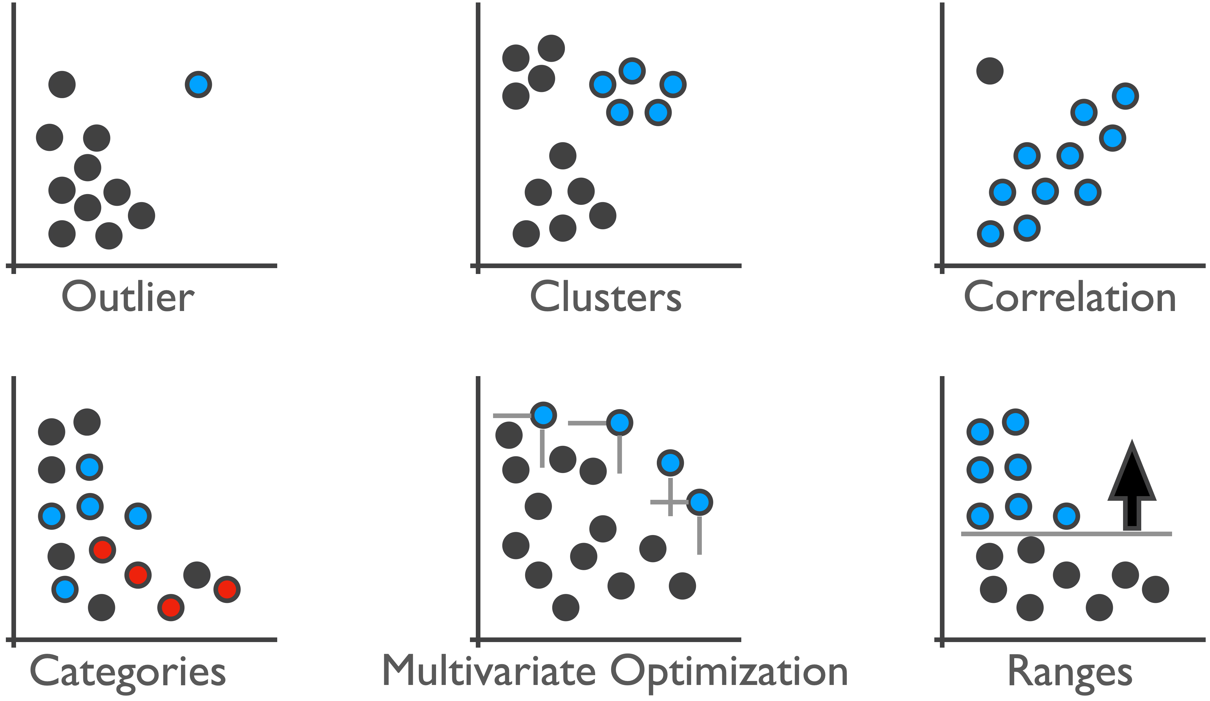
We developed methods to detect these types of intents automatically and suggest them to users. Behind the scenes, this works by computing all possible patterns using various algorithms and parametrizations and suggesting the best match for a selection. We do this for the patterns shown in the Figure below: ranges, clusters, outliers, skylines (multivariate optimizations), categories, and correlations.
So what’s the Point?
The most straightforward application of captured intent is to autocomplete an analyst’s selection. Suppose a system can determine that an analyst is trying to select outliers, as they have only selected the first two data points. We can now suggest that the analyst include other outliers in their selection. Analysts can use these suggestions to refine their selection, similar to how text-based auto-complete can help users type faster and more accurately.
Interestingly, in a crowdsourced study, we found that users are slower using this method but that the selections are of higher quality. It is worth asking whether this is a trade-off worth making. Previous work has shown that task completion times in multiparadigm interfaces can be higher compared to a single-paradigm interface. However, maybe optimizing efficiency is not a suitable goal in many contexts. Maybe multiparadigm tools can even make analysts think more carefully, judging both what an algorithm suggests and what they think is right. How meaningful are 10 seconds of an analyst’s time when trying to understand a critical dataset? We argue that accuracy is much more important than time, when the time difference is a few seconds, for most analysis scenarios.
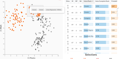
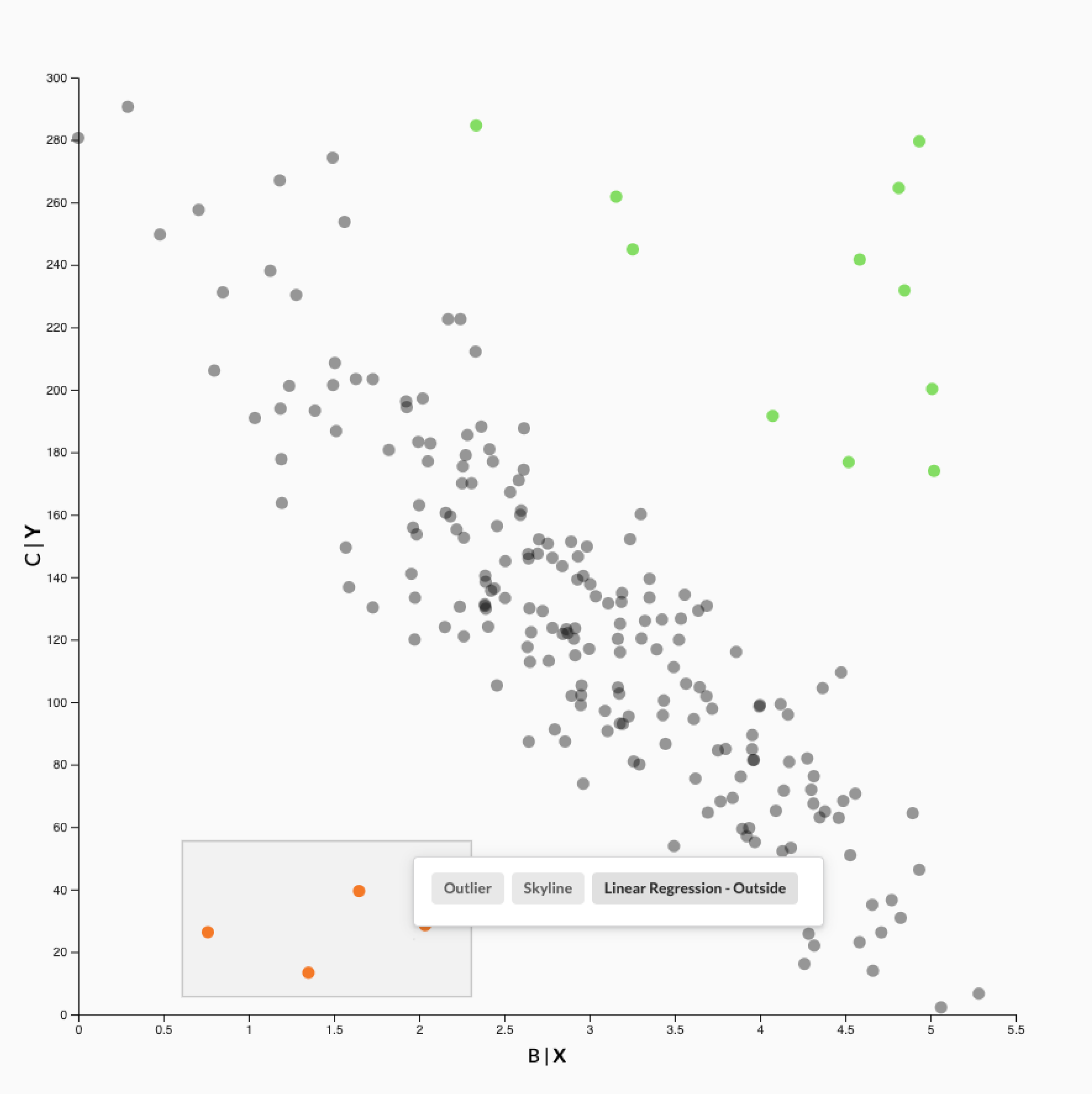 After selecting a few outliers (orange points), our system recommends to auto-complete the selection with one of three patterns: outliers, skylines, or points that don’t follow the trend in the chart. The other points that don’t follow the trend are shown in green.
The second benefit of capturing intents behind selections is the improved reproducibility of analysis after the fact. When we track all steps that lead to an analysis result, it is better to have semantically meaningful steps, such as “filter outliers,” than abstract steps, such as “filter selection.” We speculate that this can be useful both for recall by the original analyst, as well as when an analysis is being reviewed by someone else.
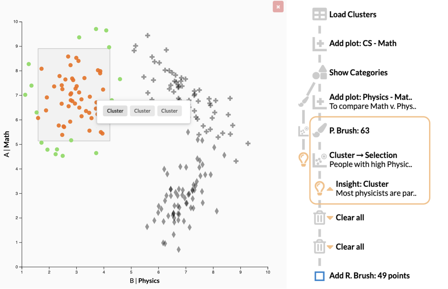 A history showing a mix of regular user actions, actions using recommended patterns such as the “Cluster → Selection” action, and a user-captured insight.
Finally, capturing pattern-based intent also enables the reusability of an analysis process. We can use semantic selections to build reusable workflows, which could even be applied to updated datasets. The details of this, however, are for another paper and another blog post!
The Paper
This blog post is based on the following paper:
Predicting Intent Behind Selections in Scatterplot Visualizations
Information Visualization, 2021