The Case Against Dashboards (when Visualizing a Pandemic)
tldr: Using dashboards comes with risks: they leave out critical context by over-simplifying and hence give false certainty. A more nuanced approach including interpreation by experts, and showing multiple perspectives is needed when visualizing data for something as complex as the COVID-19 pandemic.

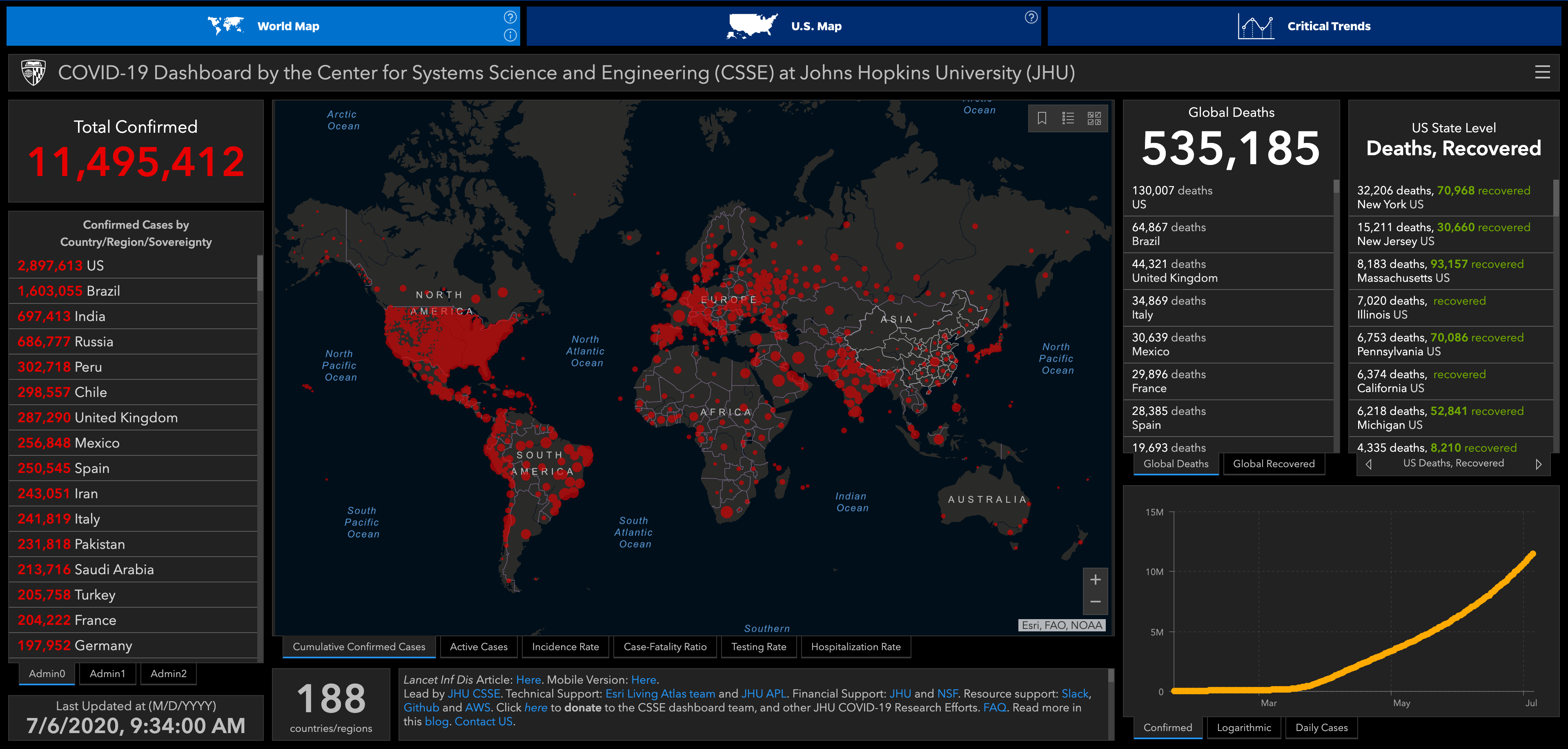
Source: Screenshot of https://coronavirus.jhu.edu/map.html, taken on July 6, 2020.
The COVID-19 pandemic of 2020 has negatively impacted our lives in many ways. The anxiety felt by many is amplified by the obsessive consultation of the latest numbers and statistics about cases, testing rates, deaths, and so on. Both the public and experts have turned to data visualizations to understand what is going on, as data visualization is a powerful tool to discover and communicate trends and relationships. Government agencies, news organizations, and academic labs have published a plethora of graphs and dashboards tracking minute details, sometimes with deceiving precision.
In addition to graphics such as the famous abstract “flattening the curve” illustration, data visualizations have been widely used to report on COVID-19 cases, death, and related metrics. Visualizations of these datasets have influenced decision making, both on a policy and on a personal level: plots of rapidly increasing cases have contributed to the increasing awareness of the problem and to the adherence to the often difficult counter-measures. The academic visualization community has both identified the many data visualizations published in the wake of this pandemic as visualization’s breakthrough moment but has also cautioned against using the pandemic as our time to show off.
COVID-19 Dashboards
And while the attention to COVID-19 data has largely been a success story for data visualization, certain dangers also abound. For example, consider the popular COVID-19 Dashboard by Johns Hopkins University, shown above.
This dashboard gives a misleading impression of certainty through different visual and numerical channels. The dashboard presents cases and deaths as precise numbers, even when the true numbers are unknowable and likely quite different. A simple change, reporting on 11.5 million cases instead of 11,495,412, would acknowledge this uncertainty to some extent. More importantly, this dashboard leaves out critical nuance: Germany, for example, is considered to be ahead of other countries in testing coverage. Hence, giving absolute numbers of confirmed cases without considering testing is likely to make Germany’s outbreak appear more severe than it is. Reporting on absolute numbers per country is also problematic as the population of countries varies significantly. Finally, this dashboard is centered on a map (using the misleading Mercator projection) with circles showing case numbers. A well known limitation of data visualizations on maps is that they tend to show population density instead of the subtleties of the underlying data: densely populated areas dominate the display. For example, in this map the United States and western Europe are mostly red, while Russia with its vast but sparsely populated land-mass has only a few small dots. This makes it look like the United States has an outbreak that is many times worse than the one in Russia, when in fact the US has “only” 4 times as many reported cases per capita.
Holistic Data Visualization
To address these shortcomings, a more nuanced approach is needed. A good example is the work by the team behind Our World in Data, at Oxford University. Instead of providing a single dashboard, they show multiple perspectives on the data, always providing context in the form of detailed descriptions. They leverage the power of data visualization to communicate trends and patterns, yet contextualize it using explanations by experts. While a single figure can’t do their analysis justice, consider the following example.
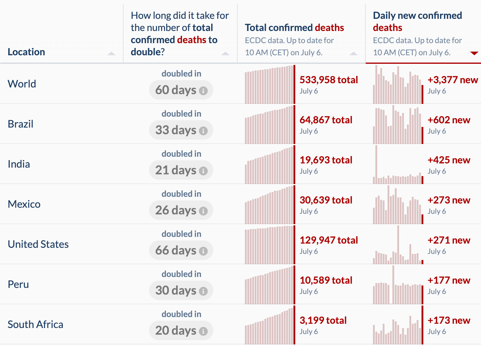
 Source: Screenshot of https://ourworldindata.org/covid-deaths, taken on July 6, 2020.
Instead of visualizing country-level data on a world map, they use a table, and add an important metric: the time it takes for the deaths attributed to COVID-19 to double. This table is sorted by the number of daily new confirmed deaths, showing the sizable toll by the US and Brazil; but also showing that Brazil, India, Mexico, Peru, and South Africa are on a problematic trajectory given their high fatality number and the fact that the death toll doubles in 20-30 days.
All the other charts on the Our World in Data website incorporate nuance like the chart above through emphasizing and visualizing the importance of testing, and visualizing mortality risks, or policy responses. Most importantly, these charts reference well-researched sources and enable others to download the data for replicability.
To summarize: data visualization cannot just show the data for complex situations in one chart or a single dashboard; instead, data visualization must be considered as one part of the data scientist’s toolbox that requires critical analysis and interrogation of data in its context. Most datasets don’t reflect the reality they aim to measure, and instead are proxies that tend to contain the easily observable data points, missing the complexity of the underlying phenomena. One of the strengths of data visualization is that it is designed for human interpretation. When visualizing these datasets, we give experts and analysts the opportunity to bring their deep contextual knowledge to bear. Consequently, it is imperative that we accompany visualizations with interpretations when we use them for communication and avoid using one chart or one dashboard to take the place of expert-driven interpretation.
Acknowledgements
Thanks to Derya Akbaba for helpful suggestions and edits.
