About
We are a team of visualization researchers at the University of Utah. Our interests include the process of designing and developing visualizations, visualization for biology, visualization frameworks, and, more generally, visualization of big, heterogeneous, and complex datasets.
VDL is part of the Scientific Computing and Imaging Institute and the School of Computing.
Blog And News
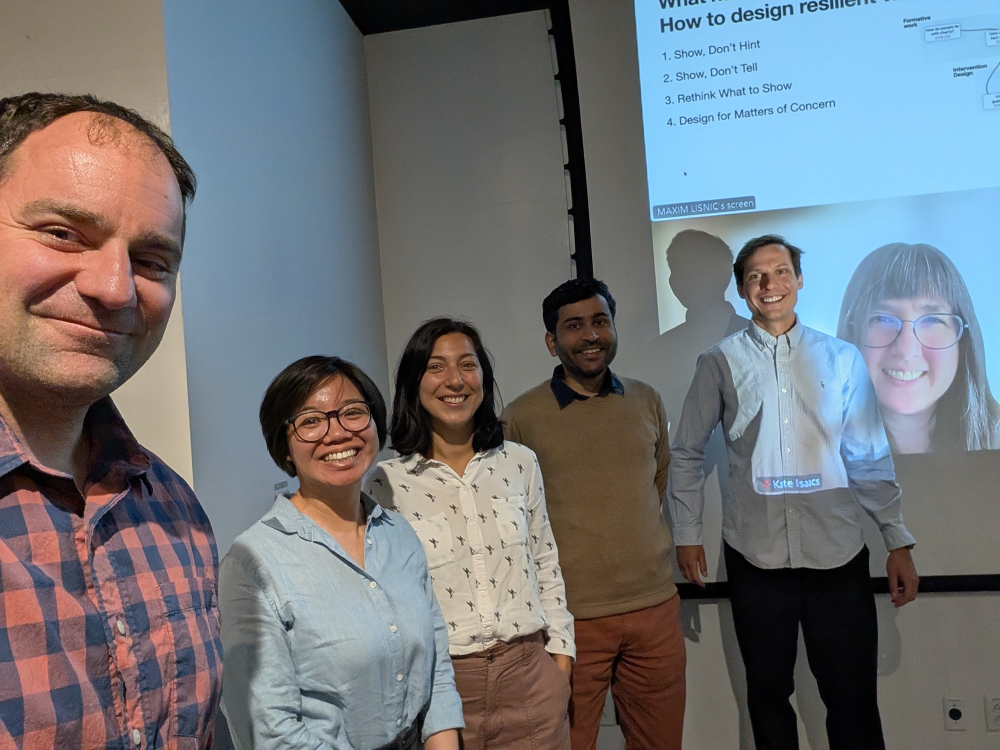
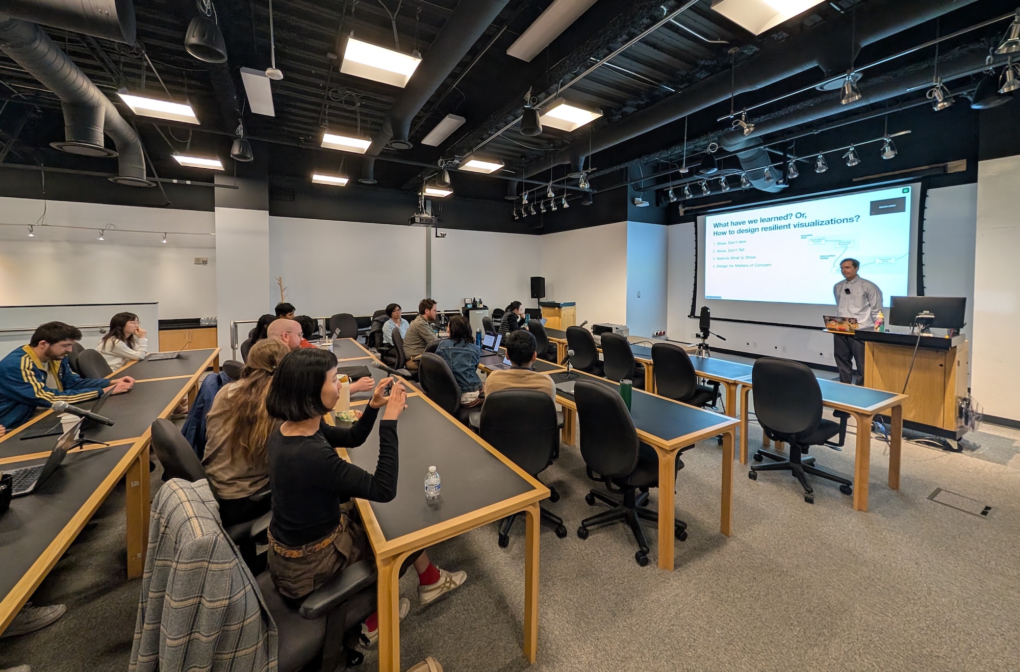
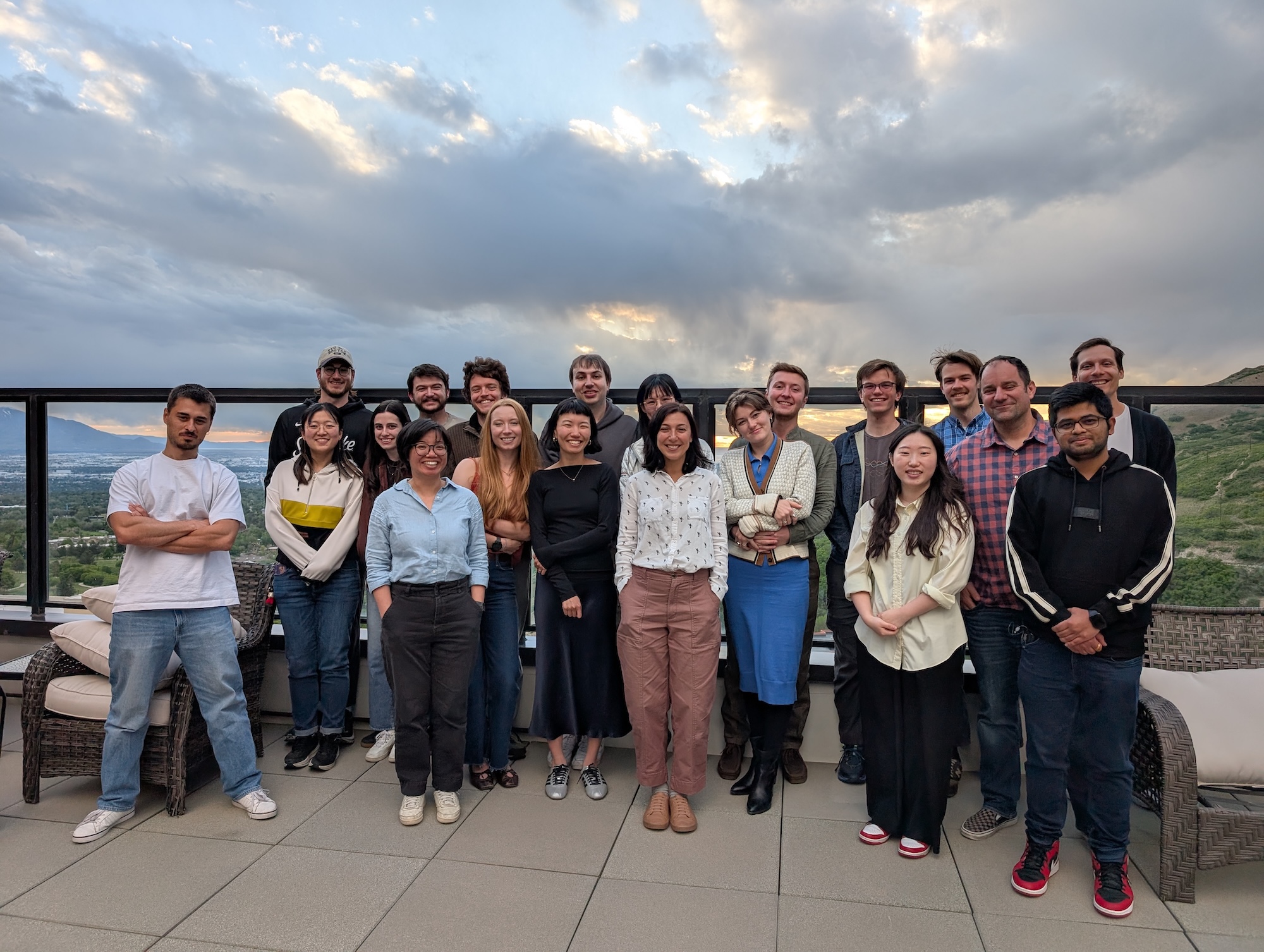
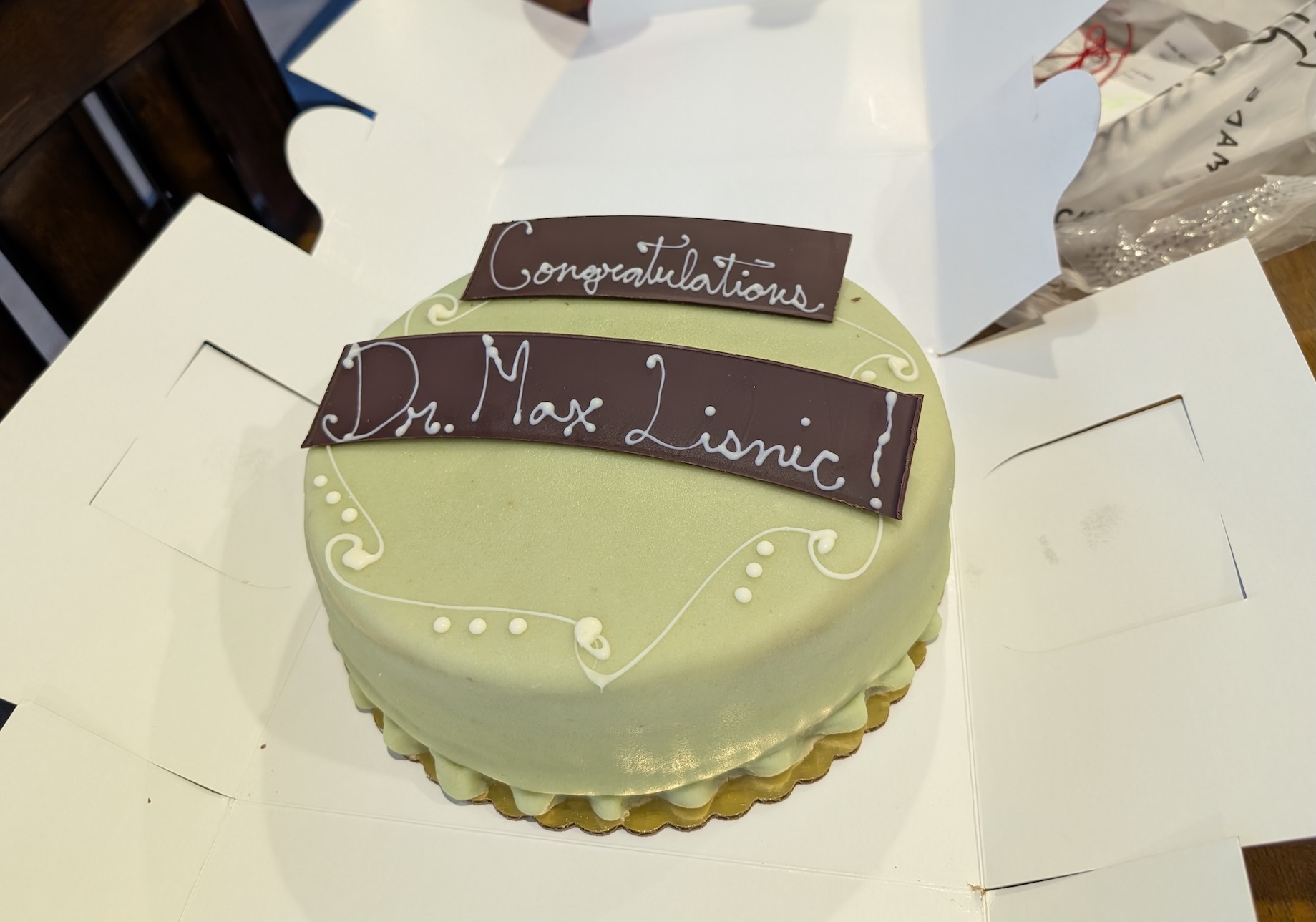
Max Lisnic successfully defended his dissertation on “Designing Resilient Visualizations Toward More Accurate Data Discourse”. Max was co-advised by Marina Kogan and Alex Lex. The committee was completed by Kate Isaacs, Vineet Pandey, and Crystal Lee.
Max will join WPI as an assistant professor this fall!
Congrats, and good luck with your next steps!