Abstract
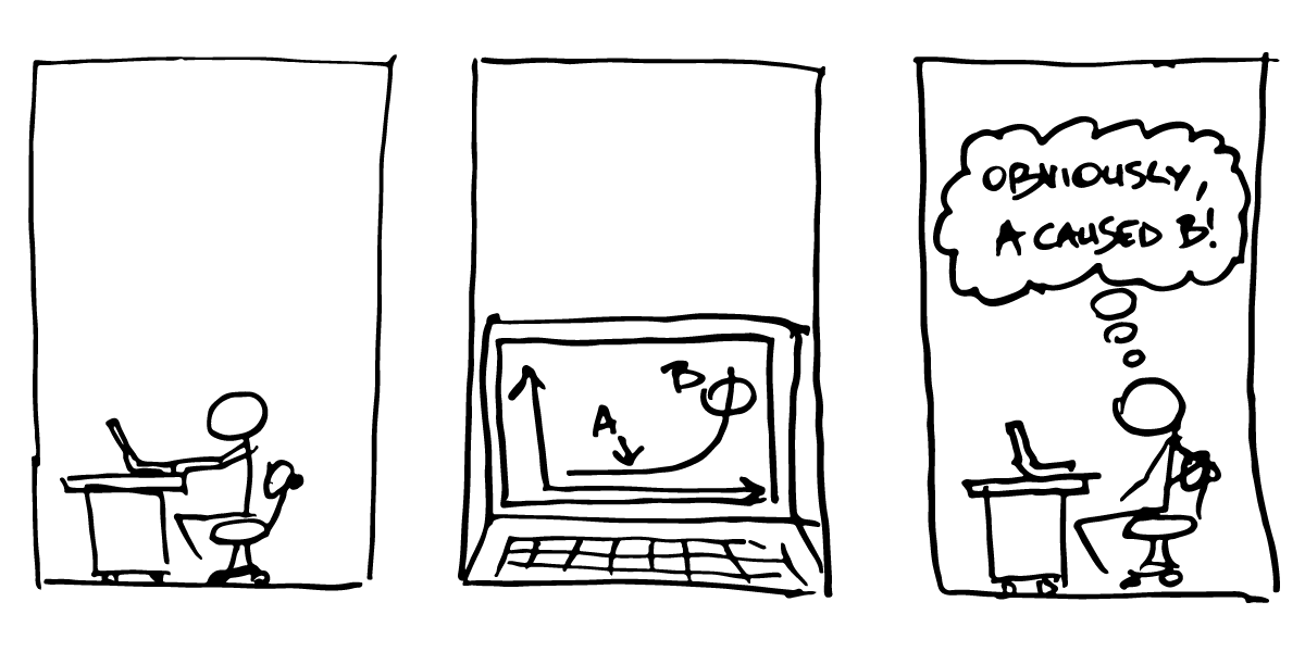
Data visualizations can empower an audience to make informed decisions. At the same time, deceptive representations of data can lead to inaccurate interpretations while still providing an illusion of data-driven insights. Existing research on misleading visualizations primarily focuses on examples of charts and techniques previously reported to be deceptive. These approaches do not necessarily describe how charts mislead the general population in practice. We instead present an analysis of data visualizations found in a real-world discourse of a significant global event---Twitter posts with visualizations related to the COVID-19 pandemic. Our work shows that, contrary to conventional wisdom, violations of visualization design guidelines are not the dominant way people mislead with charts. Specifically, they do not disproportionately lead to reasoning errors in posters' arguments. Through a series of examples, we present common reasoning errors and discuss how even faithfully plotted data visualizations can be used to support misinformation online.
Citation
Maxim Lisnic,
Cole Polychronis,
Alexander Lex,
Marina Kogan
Misleading Beyond Visual Tricks: How People Actually Lie with Charts
SIGCHI Conference on Human Factors in Computing Systems (CHI), 1-21, doi:10.1145/3544548.3580910, 2023.
BibTeX
@inproceedings{2023_chi_misleading,
  title = {Misleading Beyond Visual Tricks: How People Actually Lie with Charts},
  author = {Maxim Lisnic and Cole Polychronis and Alexander Lex and Marina Kogan},
  booktitle = {SIGCHI Conference on Human Factors in Computing Systems (CHI)},
  publisher = {ACM},
  doi = {10.1145/3544548.3580910},
  pages = {1-21},
  year = {2023}
}
Acknowledgements
We wish to thank Sunny Siu, Jack Wilburn, Vineet Pandey for their contributions. This work is supported by the National Science Foundation (IIS 2041136).