State COVID-19 Dashboards

tldr: As states are navigating the influx of COVID data, they are using dashboards to communicate with their constituents. Although many states are doing a good job at collecting and sharing data in open data portals, dashboard quality varies a lot across states, and some have considerable room for improvement.
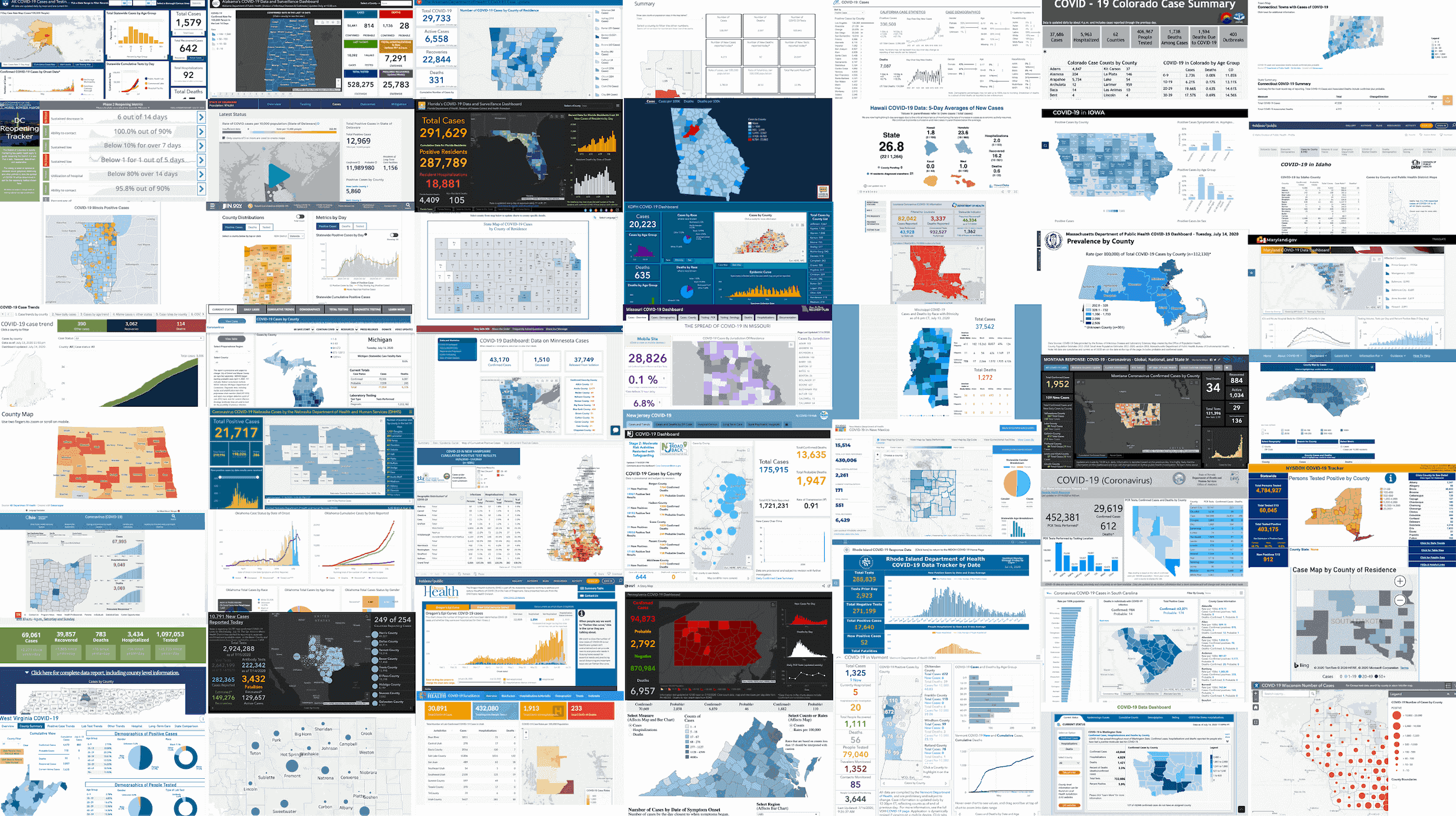
In a previous post, Alex reviewed why dashboards are problematic when visualizing COVID-19 data. This week I take a deeper look into how states are using dashboards to communicate with COVID data with their constituents.
Our deep-dive resulted in a grading system that enables a quick comparative overview across states and a more detailed breakdown of the dashboard attributes.
How to Grade a Dashboard?
Luckily for me, the foundation for our grading rubric came in the form of a checklist from the COVID Tracking Project, run by The Atlantic. The Project focuses on grading states by the types and completeness of data they publish and make accessible for public use. While this work is invaluable, as a vis researcher, I wanted to focus on the presentation of this data to the public.
There are three rubrics our dashboard grading system uses:
- Visualization best practices
- What COVID data is being visualized
- Extra credit
For part one, I approached the state dashboards with my vis cap on. I looked at visual elements that cue credibility like clearly labeling and explaining what the data represents. I also looked to see whether states visualized uncertainty either qualitatively or through standard uncertainty vis methods (such as error bars or ensembles). And given the ubiquitous nature of maps in the dashboards, I focused on common methods of (mis)using choropleth maps, like representing absolute case numbers instead of cases per population. This formed the basis of the grading system. However, this rubric does not account for data not explicitly visualized, which leads me to the second part of the grading system.
Using the COVID Tracking Project’s grading metrics, I went through each state dashboard and recorded what has and has not been visualized. While the approach is simplistic, it highlights what types of data are missing from the overall picture. Hidden data is potentially more problematic than “bad” visual encodings, because it is harder to detect, especially when there aren’t clearly established baselines.
The final scoring component, extra credit, was assigned after noticing inconsistencies in language across the dashboards. Although it is 2020, less than half of the states use the term sex correctly and ⅗ of the states separate unknown and other racial categories. While I believe these should count for more than extra credit, at the moment, they remain there, as the ignorance of state officials does not substantially detract from understanding the data.
Below are the dashboard grades per state. You can see the grading system and grades in their entirety here.
State Dashboard Report Card
Once I analyzed the grades, a few interesting trends stuck out.
No A+ for Data Vis
Even with all the potential for extra credit, the max grade that any state received for their dashboard was an A. This in comparison to the 14 A+’s given by the COVID tracking project. The reason for this is that none of the states had a complete or close to complete dashboard based on my grading criteria.
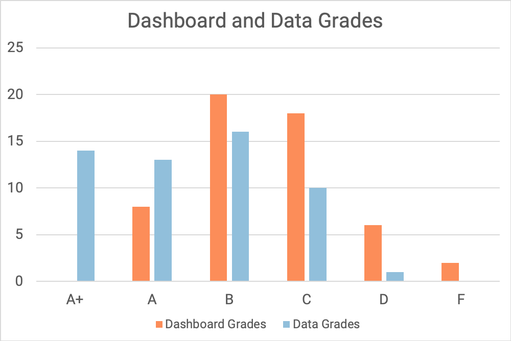
Digging a little deeper, I also did not see a strong relationship between data grades, as assigned by the COVID Tracking Project, and dashboard grades. This could be because standards for what makes a good dashboard visualization are not as well established as standards for data accessibility.
For example, New Jersey received an A+ from the COVID Tracking Project for their data sharing, but their dashboard grade is a D. Why is that? In the case of New Jersey, the visualization was lacking details. Charts are missing titles and the choropleth maps have no legend or interactivity.
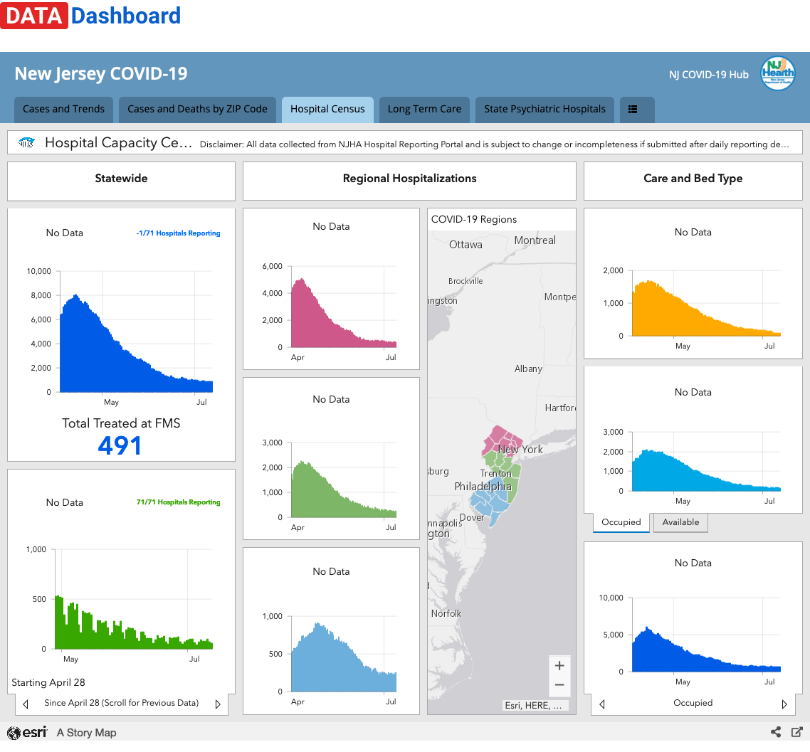 Source: Screenshot of https://covid19.nj.gov/#live-updates, taken on July 14, 2020.
Modeling and Uncertainty Neglected
Across all the states, only four states included trajectory models and six visually displayed uncertainty in their dashboards. While these numbers are low, it is unsurprising given what we know about visualizing statistics and uncertainty. Last year, Hullman interviewed vis practitioners about visualizing uncertainty and found that while most designers knew uncertainty was important, they frequently omitted it from their designs. As an illustrative example of this contradiction, one of the participants recognized the importance of uncertainty visualization, yet also defended processes they used to remove uncertainty in the data as it could reduce trust in the visualization.
Even though models and displays of uncertainty have the potential to confuse readers through added information and complexity, it is an excellent opportunity to introduce users to uncertainty in the data collection and processing process and to provide insight into the projections the states are using to predict COVID-19 cases.
What Should Go into a COVID Dashboard?
The process of grading state dashboards revealed inconsistencies not only in the data presented but also in how dashboards are implemented.
Some states link out to multiple dashboards (like Oregon) while others have a template through ESRI, Tableau, or Microsoft BI. In fact, those that belong to the latter category tend to look similar but vary vastly in effectiveness based on how they are implemented. Alaska and Alabama are both using the ESRI template, but the Alaskan dashboard reveals patterns in the case rate due to design choices in color mapping, while the Alabaman dashboard does not.
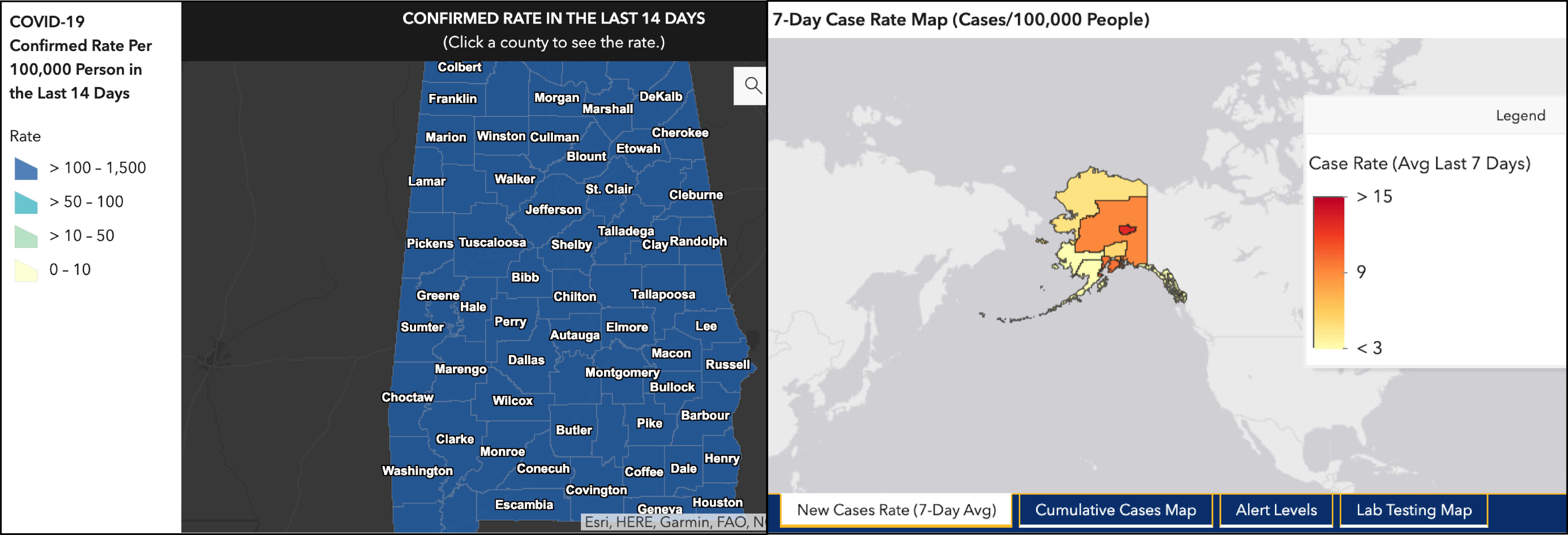 Source: Screenshot of Alaska and Alabama COVID-19 Dashboards, taken on July 14, 2020.
What’s next?
The dashboard grading system that I have implemented is by no means perfect or complete. Assigning ratings to visualizations is difficult and my choice of using binary scores for attributes fails to capture the more nuanced elements of vis. Rather than seeing the scores as a be-all, end-all, I hope that they spark conversations and begin to highlight areas of potential improvement. Designing a dashboard is not easy and as you will see, every state chose to visualize their data slightly differently, resulting in different pros and cons.
If you have thoughts, comments, or would like to collaborate on a version 2.0 of this grading system, please feel free to reach out.
Acknowledgements
I’d like to thank Alex for his feedback on both the grading system and editing this piece. And Devin for last minute edits.