Reusing Operations In Interactive Visualizations and Computational Notebooks


Interactive data analysis leverages human perception to enable various analysis tasks; however, a prior analysis can rarely be used when the dataset updates or is transferred to a different analysis environment, like a computational notebook. In this post, we discuss how we can capture reusable interactive workflows.
For the publication and prototype for capturing reusable workflows, please see the paper page.
Interactive data visualization is useful for identifying patterns in datasets, but it can also be used for data wrangling. Cleanup operations such as filtering, labeling, and aggregation, are often more efficiently done in an interactive, visual system. However, interactive data analysis is ad-hoc: when datasets update or change, an analyst has to redo the analysis and can’t just re-use operations.
Computational data analysis environments like Jupyter Notebooks, on the other hand, enable highly reusable data analysis: operations can be written inside a function, which can be called at any time and also on new or updated datasets. The flexible and reusable nature of computational environments comes at the cost of requiring programming knowledge and a lack of native support for interactive visualization.
In this work, we attempt to bridge the gap between intuitive interfaces and reusable operations by making sequences of operations (workflows) executed in interactive visualization systems reusable.
What are Workflows?
In visual data analysis, we define workflows as steps to achieve a data transformation or another analysis goal. Workflows can be explicitly modeled; or they can leverage operations captured during an analyst’s interactive analysis sessions. The latter has the advantage that analysts can interact naturally with a visualization tool without worrying about workflows until they have achieved their goal. After reaching that goal, analysts can review and curate their analysis history into a workflow.
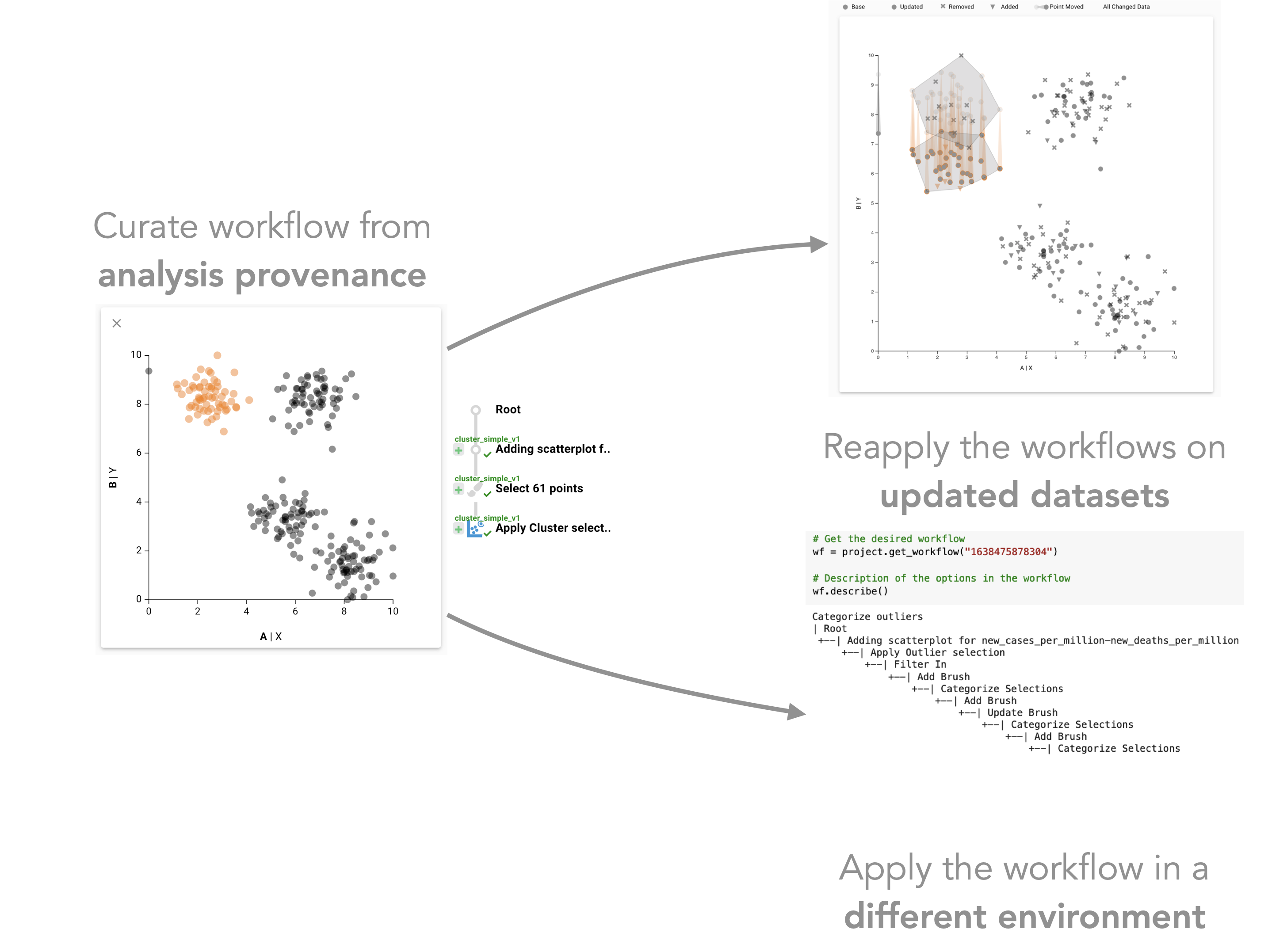
Capturing Reusable Workflows
We previously developed the Trrack library to capture interaction provenance in a visualization system. In our new system, analysts can curate the captured provenance to create a workflow, for example, by removing extraneous steps taken in the original analysis. Such simple workflows work well when they are reapplied to the same dataset but are not robust to updates in the data, as shown in the following figure.
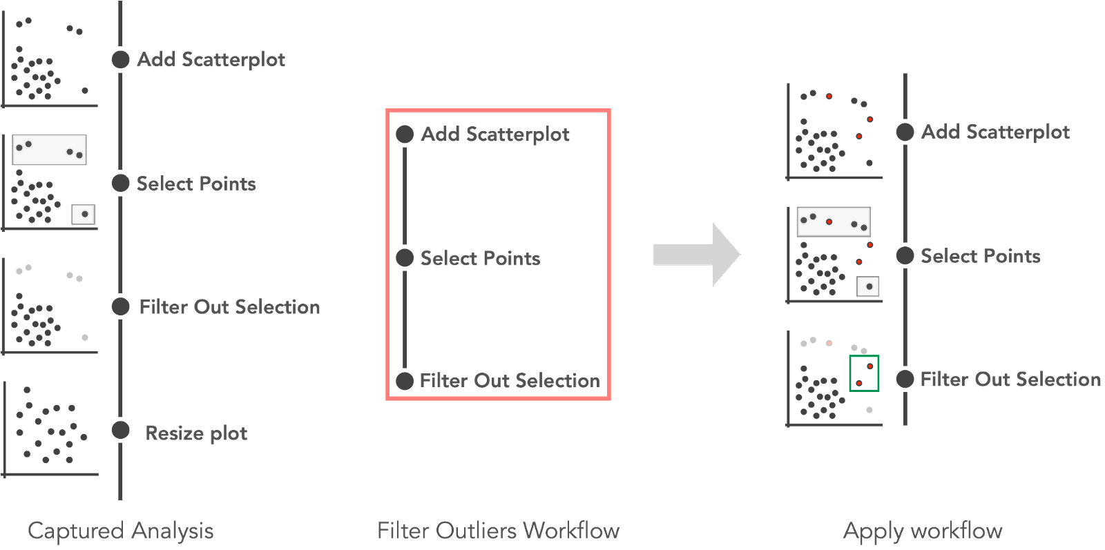 An analyst curated a “Filter Outliers Workflow” from captured provenance. The workflow is then applied to an updated dataset where three new outliers are added (red). Reapplying the workflow on the updated dataset results in two points (highlighted in green) not being detected as outliers.
To make workflows reusable and enable their application on updated datasets, we use methods that add semantic information about the patterns selected to the captured interactions. Instead of selecting a list of points as part of a workflow, we select the underlying higher-level pattern, such as “outliers” or “clusters.” The following figure illustrates the process.
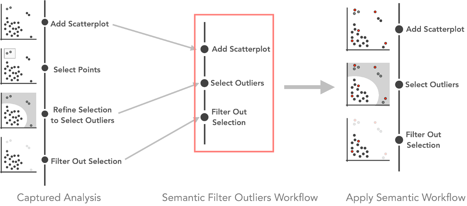 A “Semantic Filter Outliers Workflow” curated from semantically rich interaction provenance. The workflow contains the more meaningful “selecting outliers” step instead of just “selecting points.” Using such a smart workflow can help to correctly detect outliers when reapplied on an updated dataset. Here, five new points (three outliers and two inliers) were added and are correctly filtered.
So What is this Good For?
The most crucial application of captured workflows is reuse on updated or changing datasets. Datasets, as they are visualized, frequently change! Visualization might reveal problems in how the data was wrangled, requiring an update. Or new data may come in periodically. Once a dataset is updated, all steps taken with a conventional visualization tool must be repeated.
To remedy this, we developed a prototype to demonstrate how the captured workflows can be automatically reapplied when the datasets updates. The prototype allows analysts to compare the reapplication process by explicitly visualizing the difference between the datasets and interactions when applied to the datasets. The following figure shows two datasets where a cluster was selected that has moved down in an update.
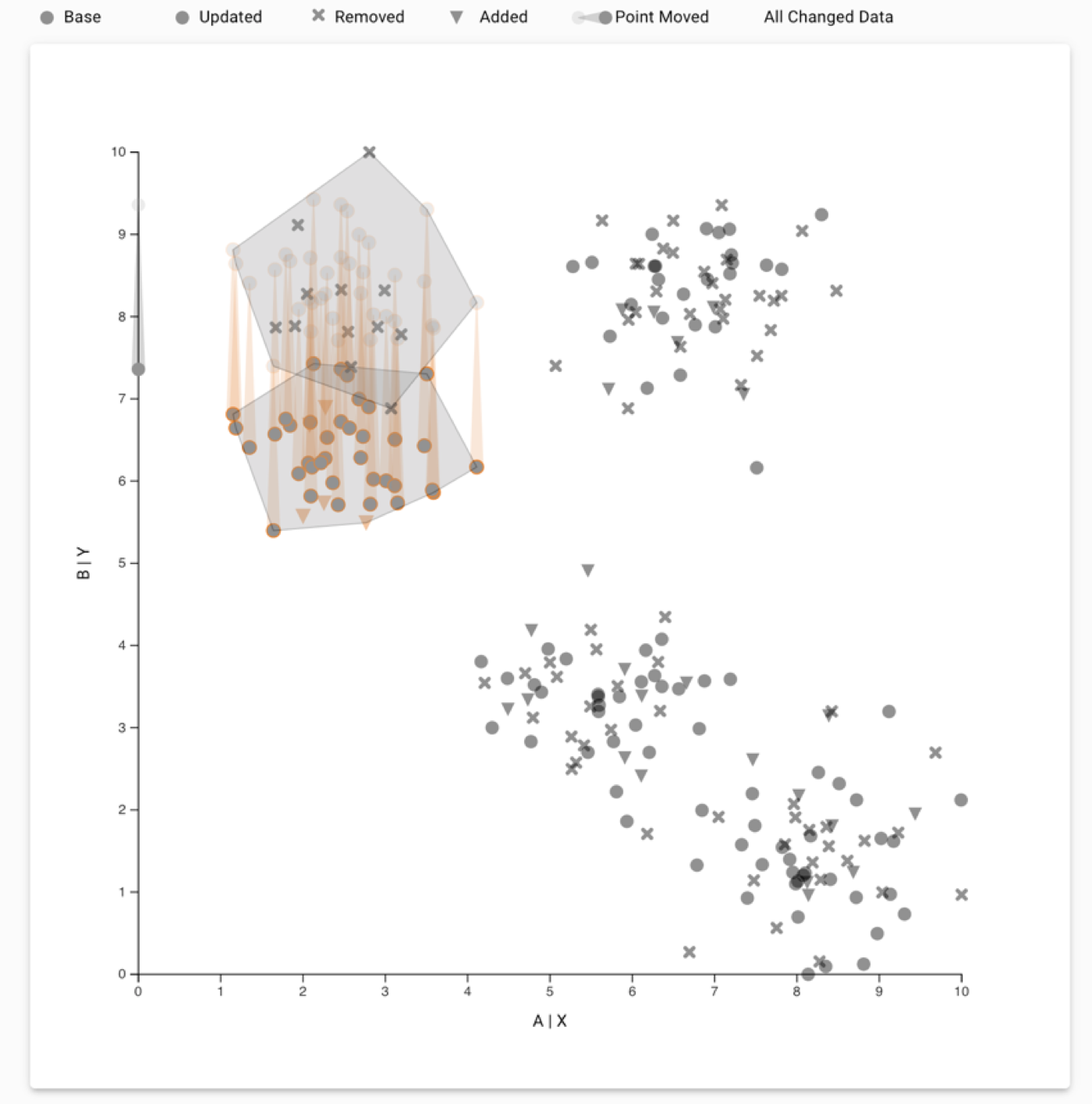
Tracking a cluster over a data update. Analysts can use the compare mode in our prototype to see their original selection and how the selection was transferred to the updated dataset. Compare mode shows the change in the points using trails for points that moved; and Xs and triangles for points that were removed and added, respectively. In this example, we see that the selected cluster moved down along the Y-axis, and the system transferred the cluster selection to the displaced cluster.
Automatic reapplication might not be appropriate depending on the update to the dataset. To handle such cases, we enable analysts to review a reapplied workflow. Analysts can approve or reject the application and add an alternate analysis for a particular dataset version. The following figure shows an example of a review that may need to be modified.
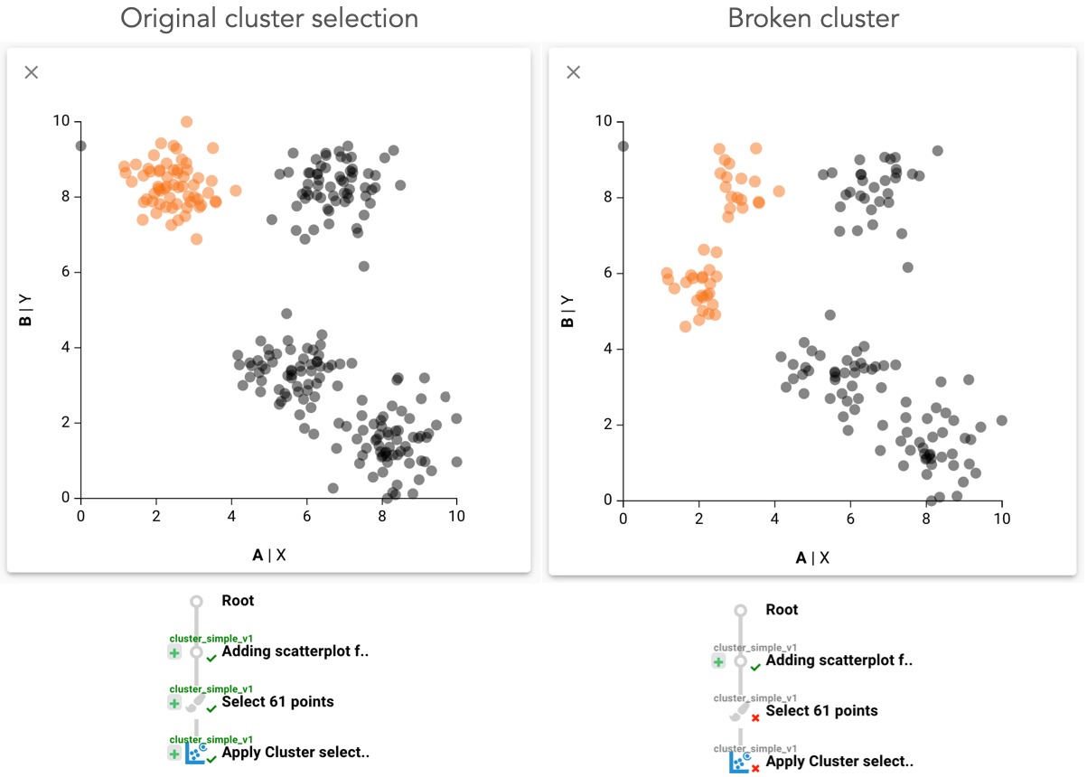 Ambiguos dataset update. An analyst created a workflow to select a cluster. The dataset was updated, and the cluster broke into two smaller clusters. The system transferred the selection and selected both the smaller clusters. As this is not what was intended, the analyst then uses the review mechanism to mark the reapplication as incorrect in the interaction provenance and subsequently can refine the selection. Approved steps are shown with green checkmarks, and rejected steps are shown with a red cross.
Bridging Between Interactive Tools and Computational Notebooks
Another application of smart workflows is bridging the gap between interactive visual analysis tools and computational analysis environments. Data analysis often involves multiple tools, and having the ability to switch from interactive tools back to a scripting approach easily has many benefits. Imagine, for example, being able to use an interactive tool to clean up a dataset, aggregate data points, or add labels or categorization, and then being able to use these newly derived values directly in a Jupyter Notebook!
We developed the Reapply python library to facilitate the use of workflows created in our prototype in a Jupyter notebook.
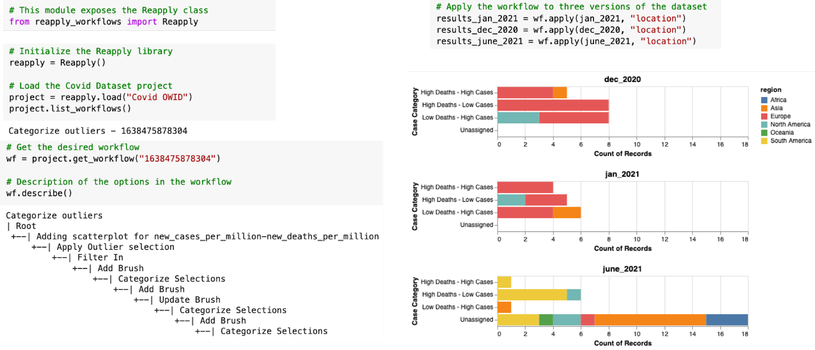 Working with the Reapply library. An analyst imports the ‘Reapply’ library, loads the Covid project and loads the ‘categorize outliers’ workflow to reapply. They apply the loaded workflow to subsets of the Covid dataset for Dec 2020, Jan 2021, and June 2021. The analyst then aggregates the datasets using the newly created ‘case category’ column and creates histograms for further analysis. You can check out the initial analysis provenance here, and the Google Colab notebook here.
We can further expand the use of reusable workflows to create workflow templates that can be generalized to reapply the workflows on unrelated datasets. In future work, we want to explore deeper integration between computational notebooks and interactive visualizations using interaction provenance.
Finally, check out our interactive prototype, and the Reapply library, or watch the video below.
The Paper
This blog post is based on the following paper:

Reusing Interactive Analysis Workflows
Computer Graphics Forum (EuroVis), 2022