Lessons Learned from Visualizing Multimodal Data... with Aardvarks...
How do you analyze data with multiple modalities – say, images, trees and time-series? If you ask a visualization researcher, we will tell you visualizations are the solution, specifically composite visualizations! This blog shares some lessons we learned designing and developing composite visualizations to help understand cancer cell development. Regarding the aardvarks... this is clickbait, mostly. But we did get a best paper award for this project at IEEE VIS.

Understanding cancer is the key to fighting it.
Cancer is a terrible disease caused by your cells growing out of control. If we can understand exactly how cancer cells grow, move, and divide, we can develop strategies to prevent, diagnose, and treat cancer.
A fundamental way to further our understanding is to collect data to represent how cancer cells are growing. It turns out that this is pretty hard because…
Cancer is complex — we need complex ✨ multimodal ✨ data to represent it.
What is ✨ multimodal ✨ data? For us, it is data in different formats that represent different aspects of the same phenomenon. Specifically, we work with 🌌 images, 🌳 trees, and 📈 time-series data.

How is this data collected?
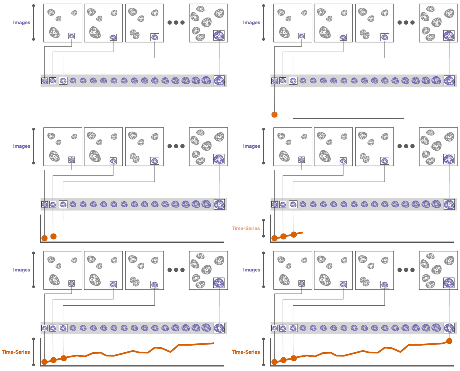
The datasets we worked with are from live-cell microscopy imaging; in other words, 🌌 images of cancer cells are recorded over time as those cells grow and divide.

Algorithms can track individual cells over time based on their position and other characteristics, such as size.
![]()
Then, derived attributes based on these images can be computed, such as the cell size or the amount of a specific protein in a cell. These attributes are calculated over time, resulting in 📈 time-series data.
During these experiments cells might divide into two daughter cells. If we record these divisions, we can construct a 🌳 tree of cell relationships or cell lineage.
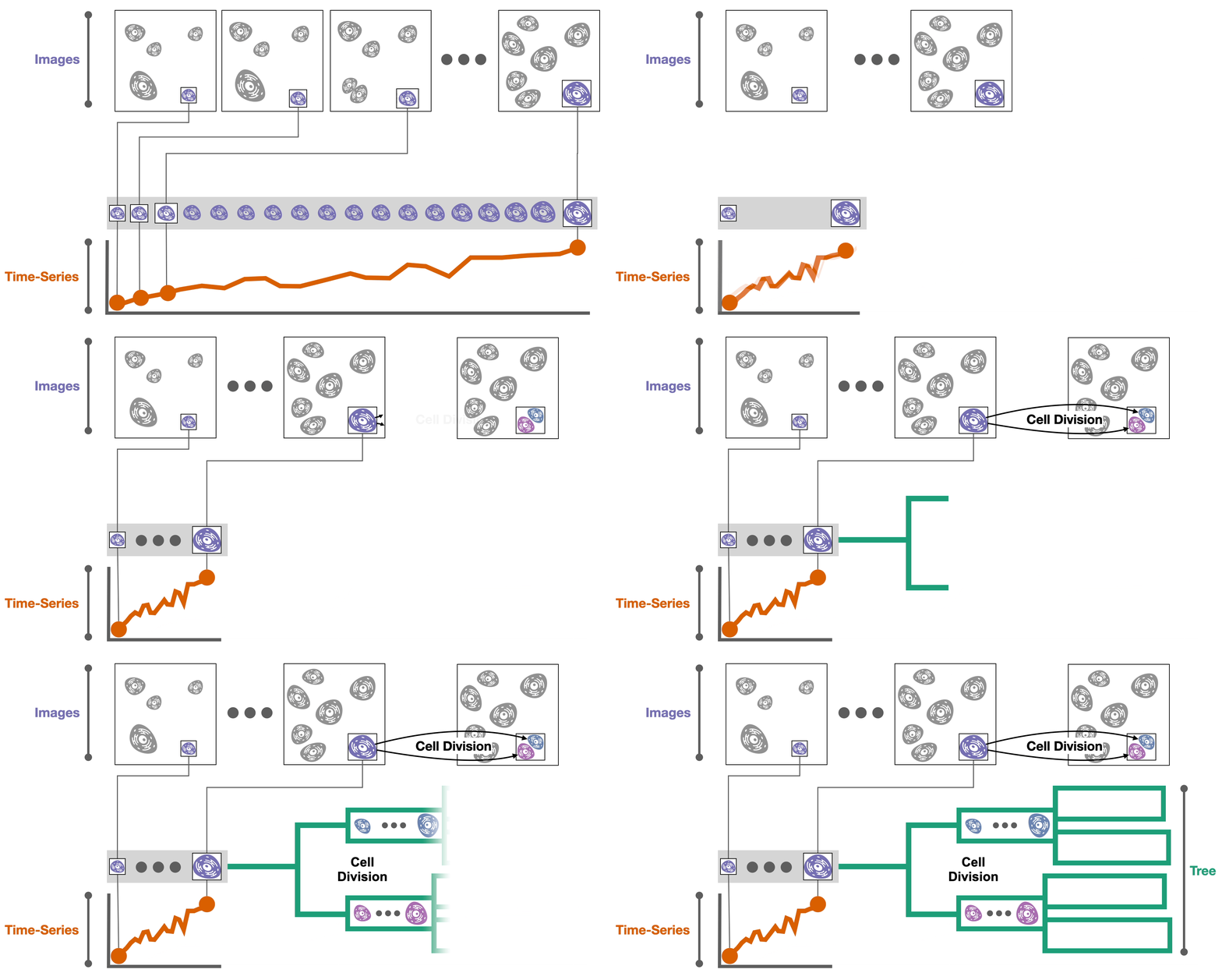
Now that we have the data, we need to try to understand it. It turns out that…
Understanding multimodal data requires us to think about all the modalities together… and this is hard.
Each of the data modalities (🌳🌌📈) is necessary because they capture a different aspect of how cancer cells develop:
- The 🌌 images show the spatial relationships between cells.
- The 📈 time-series data shows how cells grow and change over time.
- The 🌳 tree captures how cell attributes propagate across generations.
But one thing that quickly became clear was that to fully understand the phenomenon of interest (the spread of cancer cells), we needed to synthesize all three of these modalities together.
Right now, researchers are synthesizing or combining data modalities manually. In other words, they look at an image, then at time-series data, then back at an image, then at a tree, and mentally link data elements together. In the best case, this is tedious and taxing. In the worst case, it is impossible to relate elements from one modality to another.

So now what? Well, now is the part where the visualization nerds get to cheer and applaud as the hero of this story 🦸♀️ visualizations 🦸♂️ get to swoop in and save the day! This is because…
🍢 Composite visualizations 🍢 can show different data modalities together!

What are 🍢 composite visualizations🍢? In short, composite visualizations combine multiple visualizations together into the same view. (If you want a longer/better answer, Javed and Elmqvist do a great job “Exploring the design space of composite visualization.”)
This is great for our purposes because we have three different data modalities that are each represented best by different visualizations, and we are trying to link the elements across these modalities.
What’s the catch? Even though they are powerful…
Designing composite visualizations is… (you guessed it) …hard. Here’s our approach in three simple steps.
- Selected a primary data modality. Even though all data modalities are needed, specific tasks prioritize certain modalities.
- Choose the best visual encoding for it. This visualization serves as the host representation.
- Embed secondary data modalities as client visualizations.
Of course, it’s a bit more complicated than this, but we’ll get to that. First, let’s give an example.
Here’s one of the composite visualizations we designed (this one is my 🤗 favorite 🤗).
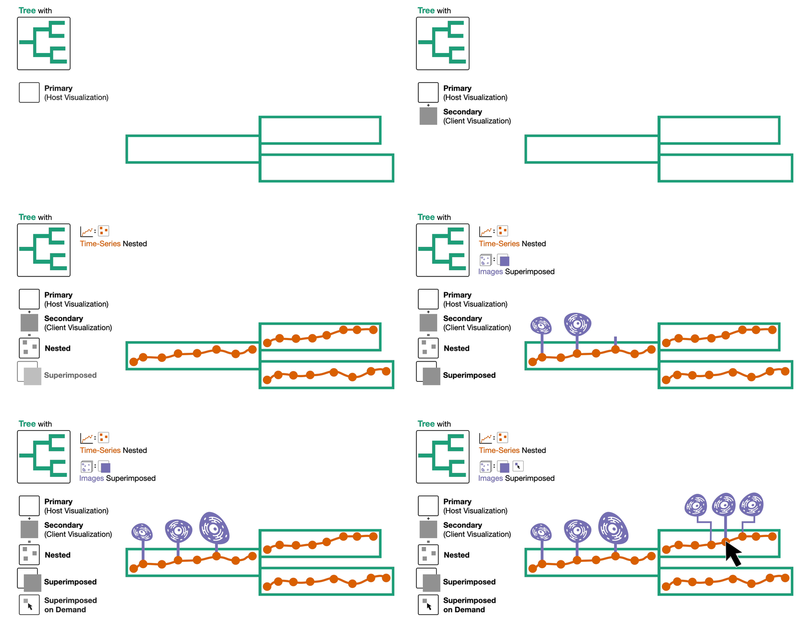
- First, we select the tree as the primary data type and, by extension, name this composite visualization the tree-first visualization.
- We encode this tree as a node-link diagram.
- Then, we embed the time-series data by nesting it within the nodes of the tree and superimpose the images of cells above the nodes either automatically or on demand.
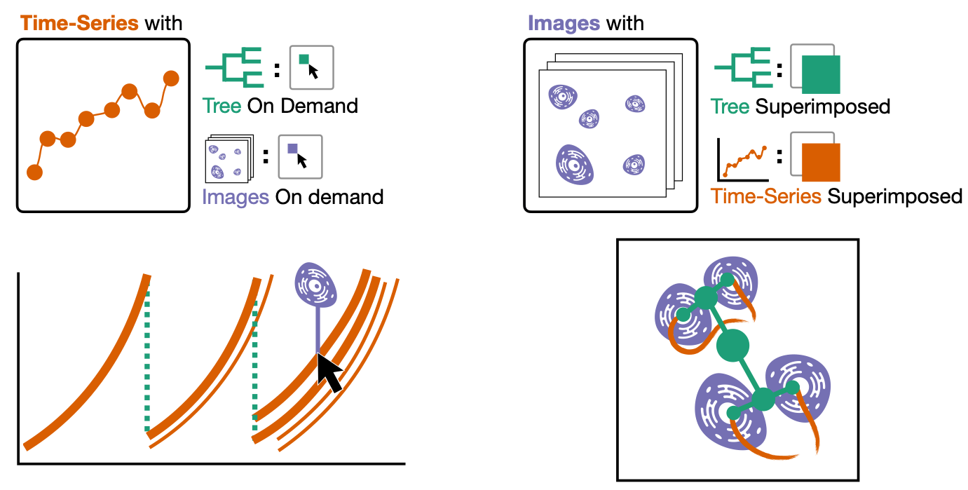
Here are the other two composite visualizations!
We call these the time-series-first visualization and the image-first visualization.
What we learned.
Ok, I have a confession. These three simple steps for constructing composite visualizations are hiding a lot of complexity. Specifically, step three is carrying a lot of weight here. In reality, this single step is a much more iterative process.
The design space of composite visualizations can be intimidatingly large. You have to choose a visual encoding for each data type AND how those encodings get combined together. The choice of one affects the other, and there will be some back and forth while exploring this space.

That said, we found that the first two steps help anchor this exploration and reduce the design space. Selecting a primary data type and prioritizing a good encoding for that data type will help ensure that tasks for that primary data type can be done effectively. With that settled, figuring out how the other pieces fit into the puzzle becomes much more manageable.
We also made a tool!
We didn’t just design these visualizations; we implemented them into a tool! It’s an excellent tool! Our collaborators like it! I like it! You can try it out yourself! You can watch a video that demonstrates it!
If you’re an extreme visualization nerd, you can even read our research paper!! The paper also goes into more detail about the design and theory pieces I talked about in this blog.
I could talk about it more, but this blog is already long enough, and I’m tired of writing it, and you are probably tired of reading it. But I promise I am actually quite proud of the tool.
Are you still here? That must mean one of two things…
You are wondering what the deal is with the aardvarks.
Well, the research paper I mentioned is titled “Aardvark: Composite Visualizations of Trees, Time-Series, and Images”. Aardvark is the name for the tool we made.
But why aardvarks?? Is it some really awesome acronym?? I bet the “v” stands for visualization!!
Sorry to burst your bubble, but it is not an acronym, I just like naming my research tools after animals (see Ferret and Loon). As to why I picked aardvarks, I think they are a cool, weird animal. 🤷
…or you want to listen to us brag about our
✨🏆✨ ~ award ~ ✨🏆✨!
We are incredibly honored and excited to share that the research paper has received a Best Paper Award at IEEE VIS 2024.
I am amped up and just a touch terrified to present to the whole conference this year in Florida! I hope to see you there! 🏖️
Ok, actually three things; you want to see the “blooper” images.
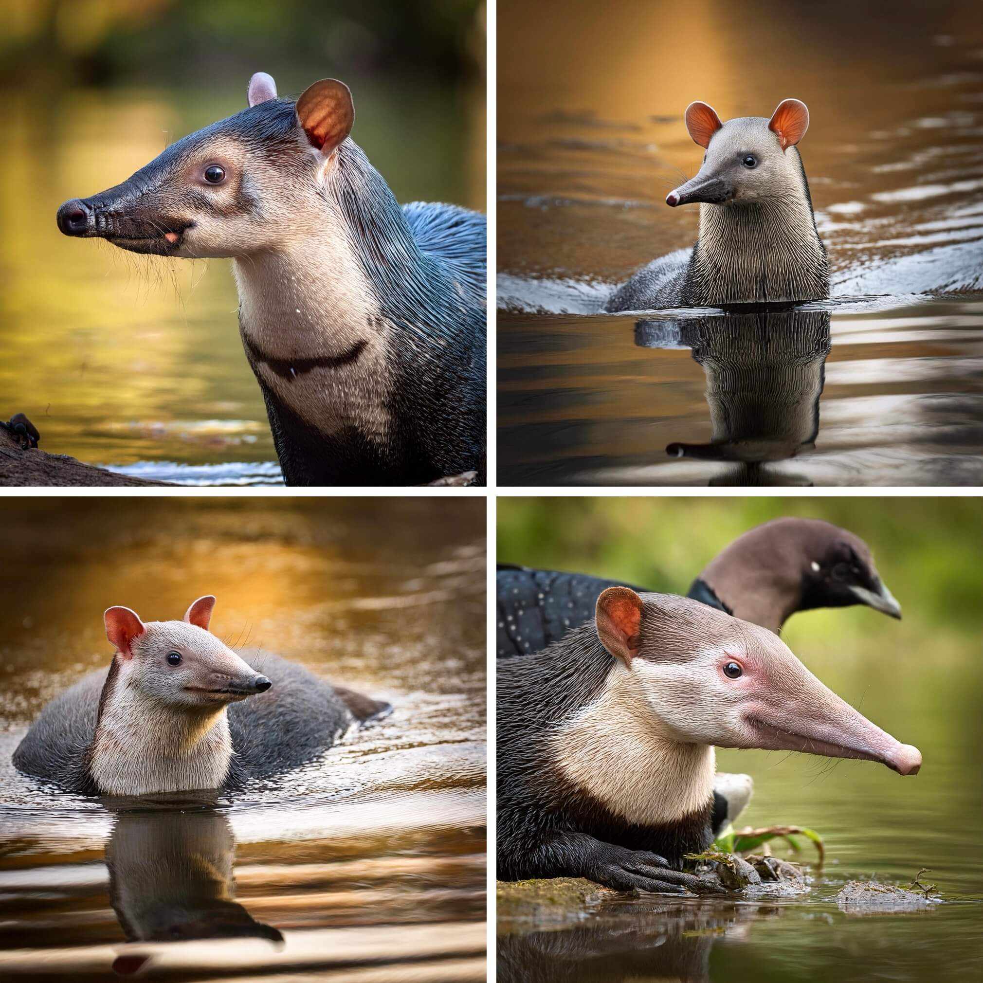
And yes, I made all of the aardvark images with AI. Specifically Adobe Firefly. These monstrosities are the result of asking for an image of an aardvark, loon, and ferret…
The Paper
This blog post is based on the following paper:
Aardvark: Composite Visualizations of Trees, Time-Series, and Images
IEEE Transactions on Visualization and Computer Graphics (VIS), 2024
IEEE VIS 2024 Best Paper Award
