Reflections on UpSet
This blog post was triggered by UpSet winning the 10-year Test of Time Award at IEEE VIS. In this post, I reflect on how UpSet came about, and what made it successful.

UpSet has won the 10-year Test of Time Award at IEEE VIS. I’m deeply honored by this award, and I want to thank the committee for choosing our paper. But most importantly, I want to thank my co-authors Nils Gehlenborg, Hendrik Strobelt, Romain Vuillemot, and my PostDoc advisor Hanspeter Pfister!
As of October 2024 the UpSet paper has been cited 1900 times. Together with Jake Conway and Nils Gehlenborg, I also wrote a short follow-up paper introducing an R version of UpSet, which has been cited 2500 times. So clearly, those papers have hit a nerve – UpSet is now the de-facto standard for visualizing set data with more than 3 sets. Also, UpSet has been re-implemented many times, making it available on various platforms and in many programming languages, which certainly contributed significantly to its success.
In this post, I want to first give a brief history on how UpSet came to be and acknowledge the giants on whose shoulders we stood, and then share my thoughts on what made UpSet successful.
How UpSet Came to Be
The intention of UpSet plots was to solve the problem of set visualizations for more than three sets. Very specifically, it was inspired by the now infamous six-set banana
Venn diagram.

This chart was widely ridiculed on Twitter back then. When I saw this, I figured that we should be able to create a better visualization for set data than that. So I did some research and found various set vis methods, including radial sets. But the method that I liked the most was a response to a “Vennerable Challenge” for Autism data by Robert Kosara:

I liked that this chart uses a simple bar chart instead of the irregular shapes that Venn diagrams use, but I struggled a bit with parsing the tree – it always had to trace paths to the root and I couldn’t spot any trends with regards to the set intersection patterns.
Also, this chart doesn’t actually plot intersection sizes as bars but a different attribute (% of correct diagnostic tests), so it’s actually visualizing something very different.
Still, this chart got me thinking, and shortly before Christmas 2013, while I was a PostDoc in Hanspeter Pfister’s group at Harvard, I sketched this in my notebook:

As you can see, all of the principal ideas of UpSet are already in that sketch: the matrix layout for sets, the bar charts for set and intersection sizes, even advanced metrics such as “deviations from expected intersection sizes” and grouping and aggregation.
I pitched the idea to my office-mate at Harvard, Nicolas Bonneel (who is a computer graphics researcher), and he immediately got the idea, but was not very excited because it “was so simple”.
I went home for Christmas and kept thinking about it and decided to give it a go for VIS. I also wanted to do this on the web; I had only done Java-based visualizations up to this point, but there was this hot new thing called D3 that I wanted to take out for a spin. So I started out and pretty quickly got to a first prototype that you can see here:

At this point I realized that I’ll need help to pull this off, especially with only three months to go till the conference submission deadline. My advisor, Hanspeter Pfister, was supportive, so we assembled the “dream team” consisting of my PostDocs friends that were also doing visualization research at Harvard: Nils Gehlenborg (at the Harvard Medical School), Hendrik Strobelt (who had just joined the lab that month), and Romain Vuillemot (at the Harvard Kennedy School).
Everyone on this team was an experienced visualization researcher, and magically, everyone found the time to really pour their heart into the project. We had many lively discussions on our wall-spanning whiteboard, and lots of heated arguments about UpSet features in its early days.
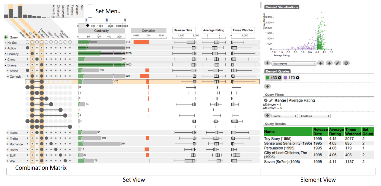
We were able to pull the UpSet paper off in just three months – from idea, to design and refinement, to evaluation, to writeup – and you can still admire the result here: https://vcg.github.io/upset/

As you can see this is actually a fairly complicated interactive visualization system. While the basic design remained the same, everyone contributed immensely to make it all come together. It took a million design decisions to actually make this work. We also used interaction extensively to enable users to answer a variety of questions. The system includes supplementary visualizations, queries, aggregations of intersections, attribute visualizations, and so on.
We made the deadline and properly celebrated the submission!

The paper received mostly strong reviews on its first submission to InfoVis.
Of course, the dreaded “Reviewer 2” found that “The proposed software and its associated methodology does not go beyond what this area has been providing as standard for the last 15 years.” Nevertheless, the other reviews were sufficiently positive, and we were happy to present it that year in Paris at the 2014 Visualization conference.
What Made UpSet Successful?
So, what made UpSet more successful than some of my other visualization papers? I think it was a multitude of factors. Some of them might be unique to this project, but others may be relevant as a lesson also for other visualization projects.
UpSet Solved a Real and Pressing Need
There really wasn’t a good way to visualize set intersections of four, five or even more sets. Existing Venn or Euler diagram solutions just don’t work, it gets too complicated to understand what sets are involved in an intersection, and area-proportionality is incredibly hard for Venn diagrams with more than three sets. And especially in the biomedical domain we saw a lot of bizarre many-set Venn diagrams:

Other solutions required interaction, or were difficult to interpret. In contrast, UpSet plots are at least somewhat self-explanatory and solve the problem.
UpSet Met Users Where They Are
If we had just stopped with our UpSet implementation where we were with our InfoVis paper, I doubt that it would have been a big success. I’m sure people in our community would have appreciated it, and might even have built extensions based on our open source code. But we realized that for broad adoption, we have to meet users where they are, and we have to communicate with them.
So we set out to build the R version of UpSet – UpSetR. The idea was that the biomedical community is already working with R for their data visualization needs. Uploading data to our web tool and then taking a screenshot would have yanked them from their workflow, and would have resulted in a “dead-end” plot that they’d have to manually adapt if their data changed. An R version would make it simple to just integrate UpSet plots in their current workflow, significantly lowering the barrier to its use.
We also promoted the UpSet, and particularly the R version in two ways: we wrote a short two-page “Applications Note” in a widely read bioinformatics journal. There was no new scientific content (as judged by the VIS community) in that article, it was just a simplified re-implementation of the tool in R.
And then we also wrote a how-to guide style article for a then popular series: Nature Method’s “Points of View”. In that article we talk about set visualization in general: for example, we recommend using Venn diagrams for two or three sets, and matrices for very large numbers of sets. But we also point to UpSet plots for the “middle ground” of 4–10 sets.
At a later point, we also set up UpSet.app to document the general use of UpSet and published a Wikipedia article on UpSet. It was a small victory when the Wikipedia article was approved for inclusion by the Wikipedia admins instead of being deleted for “lack of notability”.
A Simple Idea is More Impactful than a Complicated System
While our IEEE InfoVis submission was a complicated system with sophisticated interaction. Our team, and our reviewers, are visualization researchers, and we like to think through all of the things that we can do, and how we can leverage interactions and have cool animations.
However, the version of UpSet that really took off is not our web-based version, but the more basic one that is implemented in UpSetR:

While some features, such as sorting made it into UpSetR, others didn’t. That basic idea is simple enough, and people started using and citing it in their papers. Soon we saw other versions of UpSet pop up, for example in Python, or even a different (better) R version. At this point we know of 13 re-implementations of UpSet – so clearly, the idea transcended the implementation.
While I do think software tools and libraries add tremendous value to our community, and my team invests a lot of energy in building and maintaining software, it is certainly nice to see that an idea takes off, not at least because you don’t have to maintain the software yourself!
UpSet is Useful for Communication, Not Only Discovery
Finally, UpSet hits the sweet-spot between being useful for discovery / exploration, but also for communication. Like scatter plots or histograms, UpSet can be used in the discovery process, but is still simple enough so that they can be used as a figure in scientific articles.
Nils often complained to me that he believes that a lot of complicated visualizations don’t get “credit” for the parts they play in the discovery process, but rather give ideas that are later tested using statistical methods or simpler plots; while the visualization tool that lead to the insight doesn’t get credit (for example, in the form of a citation).
This isn’t the case of UpSet plots, which are easy for scientists to generate, given the many implementations. And unlike our web-based tools, the static Python and R tools generate “paper-ready” figures, without UI elements that need to be edited out or other issues that make it difficult to include a figure. It probably also helped that we clearly instructed users on how to properly cite UpSet.
The Future of UpSet
While I’m certain that the reason for UpSet’s success is its simplicity, I still haven’t abandoned the interactive UpSet visualization system. In fact, we’ve just released UpSet 2.0 – a version that has the same analytical features as the original UpSet, but supports data upload, public sharing of interactive UpSet plots, and can be integrated in other tools as a React component. It also has a full provenance history (including undo/redo). And it’s enabling new research: for example, we are now generating (and evaluating) text descriptions for UpSet plots, so that they can become accessible to blind and low-vision users.
In closing: thanks again to my co-authors and friends for helping bring this project to life, and to the community for this recognition.
The Paper
This blog post is based on the following paper:

UpSet: Visualization of Intersecting Sets
IEEE Transactions on Visualization and Computer Graphics (InfoVis), 2014
10 Year InfoVis Test of Time Award, 2024
