Abstract
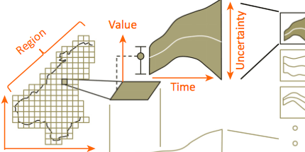
Visualisations and graphics are fundamental to studying complex subject matter. However, beyond acknowledging this value, scientists and science-policy programmes rarely consider how visualisations can enable discovery, create engaging and robust reporting, or support online resources. Producing accessible and unbiased visualisations from complicated, uncertain data requires expertise and knowledge from science, policy, computing, and design. However, visualisation is rarely found in our scientific training, organisations, or collaborations. As new policy programmes develop [e.g., the Intergovernmental Platform on Biodiversity and Ecosystem Services (IPBES)], we need information visualisation to permeate increasingly both the work of scientists and science policy. The alternative is increased potential for missed discoveries, miscommunications, and, at worst, creating a bias towards the research that is easiest to display.
Citation
Greg McInerny,
Min Chen,
Robin Freeman,
David Gavaghan,
Miriah Meyer,
Francis Rowland,
David Spiegelhalter,
Moritz Stefaner,
Geizi Tessarolo,
Joaquin Hortal
Information visualisation for science and policy: engaging users and avoiding bias
Trends in Ecology & Evolution, 29(3): 148--157, doi:10.1016/j.tree.2014.01.003, 2014.
BibTeX
@article{2014_tee_policy,
  title = {Information visualisation for science and policy: engaging users and avoiding bias},
  author = {Greg McInerny and Min Chen and Robin Freeman and David Gavaghan and Miriah Meyer and Francis Rowland and David Spiegelhalter and Moritz Stefaner and Geizi Tessarolo and Joaquin Hortal},
  journal = {Trends in Ecology & Evolution},
  doi = {10.1016/j.tree.2014.01.003},
  url = {http://www.sciencedirect.com/science/article/pii/S0169534714000160},
  volume = {29},
  number = {3},
  pages = {148--157},
  year = {2014}
}
