Abstract
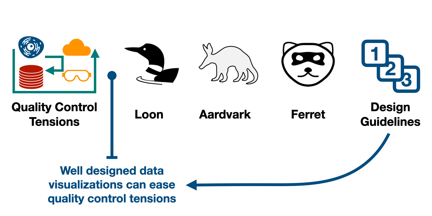
Scientific inquiry is difficult. Collecting data on a phenomenon can reveal new insight into it. However, collecting and interpreting such data requires human expertise. In particular, distinguishing between a pattern in data is the result of the underlying phenomenon being measured or an error in the data collection requires a careful review of data while incorporating expert knowledge and human judgment. This dissertation describes two tensions that contribute to the difficulty of this review process. It then claims that visualizations are a valuable tool for easing these tensions.
To back up this claim, this dissertation describes three main contributions that provide specific examples of where visualizations have helped with the quality control process: (1) a cell microscopy visualization system that uses exemplar data points to bridge the gap between detailed individual data points in a large dataset, (2) composite visualization techniques that improve the interpretability of multi-modal data, (3) a visualization system for reviewing datasets for manipulation that embeds knowledge on common patterns found in manipulated data and guides the user through this knowledge without being prescriptive.
Citation
Devin Lange
Is that Right? Data Visualizations for Scientific Quality Control
Advisors: Alexander Lex, Paul Rosen, Kate Isaacs, Nils Gehlenborg, Hanspeter Pfister
University of Utah, PhD Thesis, July 2024.
BibTeX
@phdthesis{2024-thesis-lange,
  title = {Is that Right? Data Visualizations for Scientific Quality Control},
  author = {Devin Lange},
  school = {University of Utah},
  month = {July},
  year = {2024}
}
