How Far Can We Push Crowdsourced Evaluation of Visualization Techniques?

Crowdsourcing is a popular method for conducting quantitative studies, yet up to now, the types of studies that were run on crowdsourcing platforms is narrow. In this blog post, we describe a method to evaluate complex visualization techniques in a crowdsourced setting, which we developed for a 2020 CHI paper on evaluating multivariate network visualization techniques.
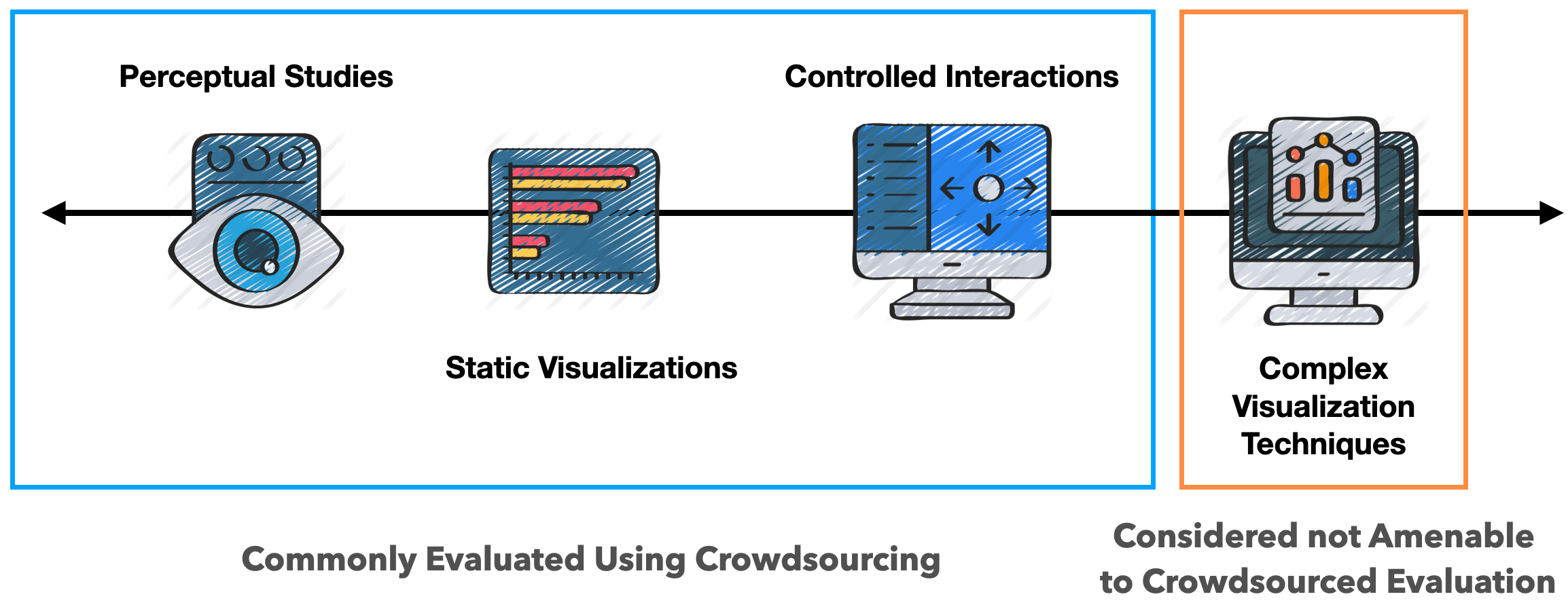
Quantitative studies are usually confined to conditions where all factors can be controlled, making them less suitable to evaluate complex visualization systems.
User studies are a powerful tool to evaluate visualization techniques. In our recent CHI paper Evaluating Multivariate Network Visualization Techniques Using a Validated Design and Crowdsourcing Approach we present a crowdsourced study comparing two common network visualization techniques: node link-diagrams and adjacency matrices. We’re hardly the first ones to run such a study (see for example Ghnoiem et al. and Okoe et al.), although ours is different from other work as it focuses on the attributes associated with nodes and links in the networks, and our designs are highly interactive. If you’re a network geek, please check out the full paper, but in short, we found various pros and cons of matrices vs. node-link diagrams. Most importantly, we were able to show that these representations lead to different types of insights.
In this blog post, we want to take a look at a different, more general, aspect of our paper: our study methodology.
Quantitative and Qualitative Studies
The common dichotomy in VIS research distinguishes between quantitative and qualitative evaluation approaches. Quantitative methods are used to study conditions where the factors of a design can be controlled, so that we can clearly attribute any differences in performance or preference to these factors. Due to the need for control, these types of studies are usually done in a narrow context, with perceptual experiments (e.g., Jardin et al.) on the extreme end, and tools with limited interaction on the other end (e.g., Feng et al.). Such controlled studies ideally lead to reproducible, robust knowledge, but frequently lack ecological validity, which makes applying the results sometimes difficult.
On the other end of the spectrum are qualitative studies that look at the effect of a complex visualization system on (possibly a real user’s) visual analysis tasks. These efforts often involve gathering data through interviews with domain specialists and over-the-shoulder observations of analysis workflows. A common example of qualitative studies are case studies frequently found in visualization design studies, or deployment studies where participants are asked about their experience with the visualization after an extended period of time. In contrast to quantitative studies, qualitative studies have high ecological validity but limited generalizability.
So roughly speaking: a simple stimulus where every factor can be controlled is well suited for a quantitative study. For everything else, you have to resort to other methods, such as qualitative evaluation, or insight-based evaluation. [Note that this all is a simplification, and much has been written about evaluation. I particularly like Carpendale’s “Evaluating Information Visualizations” paper.]
This makes it difficult to quantitatively evaluate the relative performance of two (or more) complex and/or interactive techniques: they are too complex to clearly isolate the factors that lead to performance differences, yet comparing techniques is also ill-suited for qualitative approaches.
A Method for Quantitative Crowdsourced Studies of Complex Visualization Techniques
To address this problem, we developed a new method that allows us to compare two (or more) different and complex visualization techniques using crowdsourcing. Our approach rests on three pillars: (1) careful design, (2) validation of the implementations of the techniques being evaluated; and (3) training of non-expert, crowd participants in interacting with these complex visualizations. We use crowdsourcing for its advantage of scale: it is very tedious to collect large sample sizes with laboratory experiments, yet it is trivial to recruit hundreds of participants using crowdsourcing. The challenges of design, code quality, and training are, however, amplified in a crowdsourced study.
Design
First, we need to choose which techniques to evaluate. We recommend using our methodology for established approaches that have stood the test of time. In our case, we choose adjacency matrices and node-link diagrams – two widely researched network visualization techniques. It’s probably unwise to use our method for novel techniques developed by the same group that runs the study, as this can lead to various biases. For example, the novel technique might have been unconsciously given more attention than the competition.
We also do not recommend comparing existing systems. We believe it is important to implement the techniques studied simultaneously using the same principles and aesthetics. This leads to reduced variability and likely more meaningful results. Little details in a complex system can affect usability (and therefore preference and performance), but if both systems are designed to be as similar as possible, this threat is reduced.
To design the techniques, we drew on the vast amount of prior work and followed best practices both for visual encodings and for interaction design. When selecting which interactions to include, we decided to implement those that are naturally afforded by the visualization technique. For example, we implemented an interactive sorting feature for our adjacency matrix – it enabled sorting by a “clustering measure”, but also by attributes. The node-link diagram, in contrast, doesn’t have an equally powerful method to reveal nodes that have the biggest or smallest attribute. We decided against a sorting feature for the node-link diagram because it’s not a feature that would work well, and is not usually expected from a node-link diagram.
We also debated whether we should include features that are not essential for the techniques, such as interactive legends. An interactive legend could be used to solve some tasks easily, yet if it’s mainly the legend that is used to solve a task, it wouldn’t be the visualization technique that led to the result. It is also useful to consider what the purpose of tasks in users studies is: we argue that tasks (e.g., find the most connected node) really are proxies for an analysis process that is much more exploratory in reality. Solving an artificial task can often be done easily with query interfaces, yet that’s not the point: We use these tasks to simulate questions that might arise naturally when exploring a dataset.
Of course, many of these factors may vary depending on the underlying research questions. What is important is to navigate these factors with care, to ensure fair comparison between the techniques in question.
You can check out our designs and get an impression of the level of interactivity of our techniques in the following videos. You can also play with live versions of the two techniques.
Demonstration of interaction in the adjacency matrix condition.
Validation
As a next step, we validated our designs to test their fitness for use and to verify that our designs are sound. To identify usability problems with the system and issues with the study design, we ran multiple pilots, both informally with students, or on Prolific, the crowdsourcing platform we used. To externally validate our designs, we reached out to network visualization experts to perform a heuristic evaluation. We followed Wall et al.’s methodology, but extended their survey with tailored questions (see supplementary material on the paper’s page), including questions on how we could improve the techniques. Based on the feedback we received, we revised the designs and again tested for usability problems in pilots.
This careful design and validation approach resulted in two interactive techniques that we believe are “as good as it gets”, while being limited to the affordances of each technique. Given such carefully designed implementations of well known techniques, we can eliminate as many confounding factors as possible and can actually get to the inherent strengths and weaknesses of each interactive visualization technique. The experts we asked to review these techniques provided both validation and thoughtful suggestions on improving the techniques for comparison.
Demonstration of the interaction in the node-link condition.
User Training
The second aspect that one needs to consider when evaluating an interactive technique is user expertise. Node-link diagrams, but especially adjacency matrices aren’t techniques that the general population is familiar with. What we care about in many situations, however, is how well an (at least slightly) experienced user would be able to answer analysis questions with a particular technique. Training study participants is tedious in lab studies, but even more so in crowdsourced studies, as the typical task in a crowdsourced study is usually short and requires little training. Crowdsourcing participants are also commonly less attentive than lab study participants.
To get crowdsourcing participants the required expertise to successfully use a technique, we trained them for about 15 minutes. We first showed a video, introducing the principles of the visualization technique (passive training), followed by an interactive training component, where they had to solve certain tasks (active training). You can try out the training on the demo website by taking the full survey.
The study itself lasted 40 minutes on average, which is long for a crowdsourced study. Given the overall high accuracy rate (>75% across conditions), we believe that our training was successful. It is likely that such trainings could be adapted for comparing many different visualization techniques and scenarios in crowdsourced settings
Other Considerations
Another aspect that we believed contributed to the high accuracy and engagement was our above-average compensation. We offered the equivalent of a $15 USD hourly wage for a 40 minute study, which is much higher than the typical wage on Amazon Mechanical Turk, and twice as high as the minimum required by Prolific. We also found that high compensation leads to high engagement: in our final open exploration tasks, we asked participants to explore the data and write down any insights they might have had. Even though they could have just clicked away the answer box, about 80% of all participants chose to provide answers with meaningful insights, at the very end of a 40 minute study.
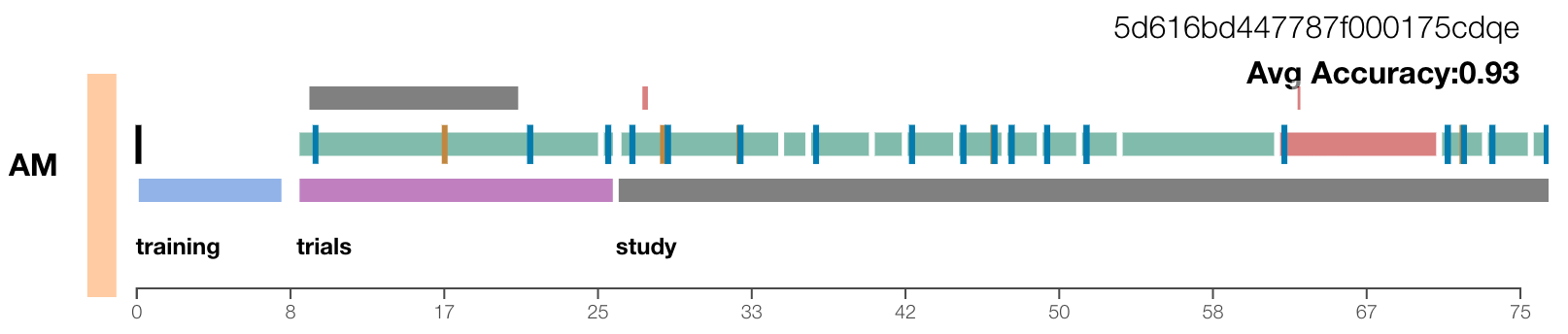 Visualization for analyzing logging data.
We also used advanced logging in the form of fully-fledged provenance tracking for our study. This data, and a custom visualization (shown above) we built to explore it, was useful to identify and correct a variety of problems. For example, we were able to subtract the time that participants browsed away from the study window in this way. A more detailed discussion of our provenance tracking and analysis approach, however, is better reserved for a separate blog post.
Conclusion
We believe that our techniques were among the most complex interactive visualization techniques ever evaluated quantitatively using crowdsourcing, and we believe that our study has higher validity (conclusion, internal, construct, external, and ecological) than other crowd-sourced studies. Obviously, our approach is no panacea: the type of systems that need deep domain expertise, for example, can’t be easily evaluated this way. It’s also not appropriate to compare two independently developed systems, or to evaluate a newly proposed technique. Finally, we can’t match the depth of insights derived from qualitative methods.
And even though there are many challenges with our approach, if done carefully, we argue that our method – careful design, usability testing, external evaluation, training, and above-average compensation – makes it possible to run meaningful quantitative evaluations of complex, interactive visualization systems. Given our results, we believe that a much broader range of experiments can be run using crowdsourcing platforms than was previously thought.
Acknowledgements
I’d like to thank Carolina Nobre, Dylan Wooton, and Lane Harrison for their help with this blog post and for being great co-authors on the paper!