Persist — A JupyterLab Extension for Persistent Interactions


Computational notebooks like JupyterLab have become indispensable tools, enabling seamless integration of code, visualizations, and text. However, modern notebooks limit the usefulness of interactions in visualizations in two significant ways. First, the results of interactions in visualizations cannot be accessed in code. For example, a filter applied in a visualization cannot be applied directly to the data in the notebook. Second, unlike code changes, interactions with data visualizations are transient — they are lost when the cell is re-executed or the kernel is restarted. In this post, we introduce our solution to these issues: Persist, a JupyterLab extension that enables persistent interaction and data manipulation with visualizations in notebooks.
For the publication and details on the Persist technique, please see the paper page.
In this blog post, we’re introducing Persist, our Jupyter Plugin, to make interactivity in Jupyter notebooks useful and persistent. Jupyter is open source and available on GitHub. Head on over to the Persist website to learn more, or join the community on Slack.
Computational notebooks are a modern realization of Donald Knuth’s vision of literate programming. These notebooks allow us to seamlessly mix code, visualizations, figures, and text to analyze data and narrate the analysis. The most popular notebooks are Jupyter notebooks.
Jupyter supports interactive outputs like Vega-Altair charts and Jupyter Widgets in addition to text, static plots, and tables. Code-based analysis in notebooks can be re-run, and the results of one cell can be used in another, making the analysis reproducible and reusable. In contrast, interactive analysis in notebooks presents significant challenges concerning reproducibility and reusability.
Visualizations in Notebooks are a Dead End!
Until now, there has been a significant disconnect between code and the interactive outputs of notebooks. While code can generate interactive visualizations (such as those created with Vega-Altair), the results of these interactions cannot be accessed in code. For instance, if a filter is applied in a visualization, analysts must write additional code to replicate the filter if they want to use it later in their notebook. This limitation vastly reduces the usefulness of interactions within visualizations.
Furthermore, there is a disparity between code and interactions in terms of persistence. Changes to the code are saved and persist across restarts and re-executions. However, interactions are transient and are lost when the notebook is restarted or the cell is re-executed. This lack of persistence makes visual analysis difficult to reproduce without the added effort of documenting each visual analysis step.
Persist makes Interactive Visualizations in Notebooks Useful.
To address these challenges, we have developed Persist, a JupyterLab extension that captures interaction provenance, making interactions persistent and reusable. Persist bridges the gap between code and interactive visualizations, ensuring that all interactions are tracked, recorded, and can be reapplied automatically.
Analysis with Persist
It’s easiest to see how it works by following an analysis. We’ll look at avalanches in the Utah mountains. You can follow along using this binder instance. (Binder instance might take a few minutes to start the first time — please be patient.) You can also download the notebook and run the notebook in a local JupyterLab instance. Follow the instructions here to set up local JupyterLab with Persist extension.
The notebook uses Vega-Altair to create interactive visualizations and assumes some familiarity with Vega-Altair, Vega Lite, and the declarative approach to creating visualizations. For a quick introduction, refer to their getting started. You won’t have to write any Vega-Altair code to follow the blog.
We will load the data in a Pandas dataframe.
import pandas as pd
import altair as alt
import persist_ext as PR # Load the extension

av_ut = pd.read_csv("avalanches_ut.csv") # load the csv
av_ut.head()
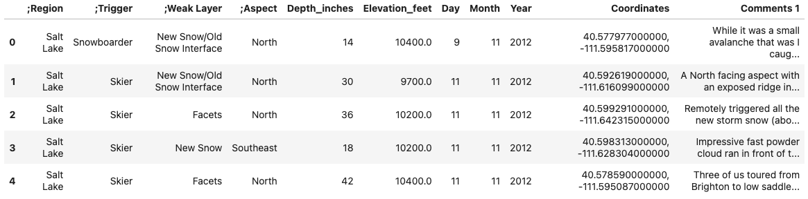
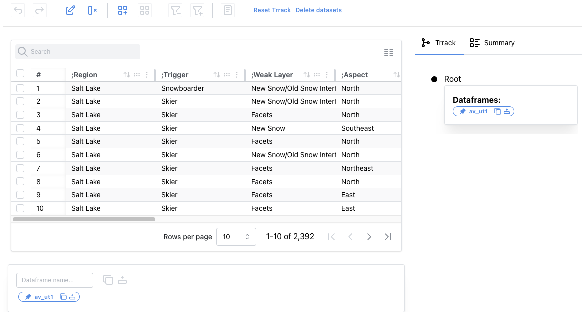
After loading the data, we examine it in an interactive data table using the following code.
PR.PersistTable(av_ut, df_name="av_ut1")
Working with Columns
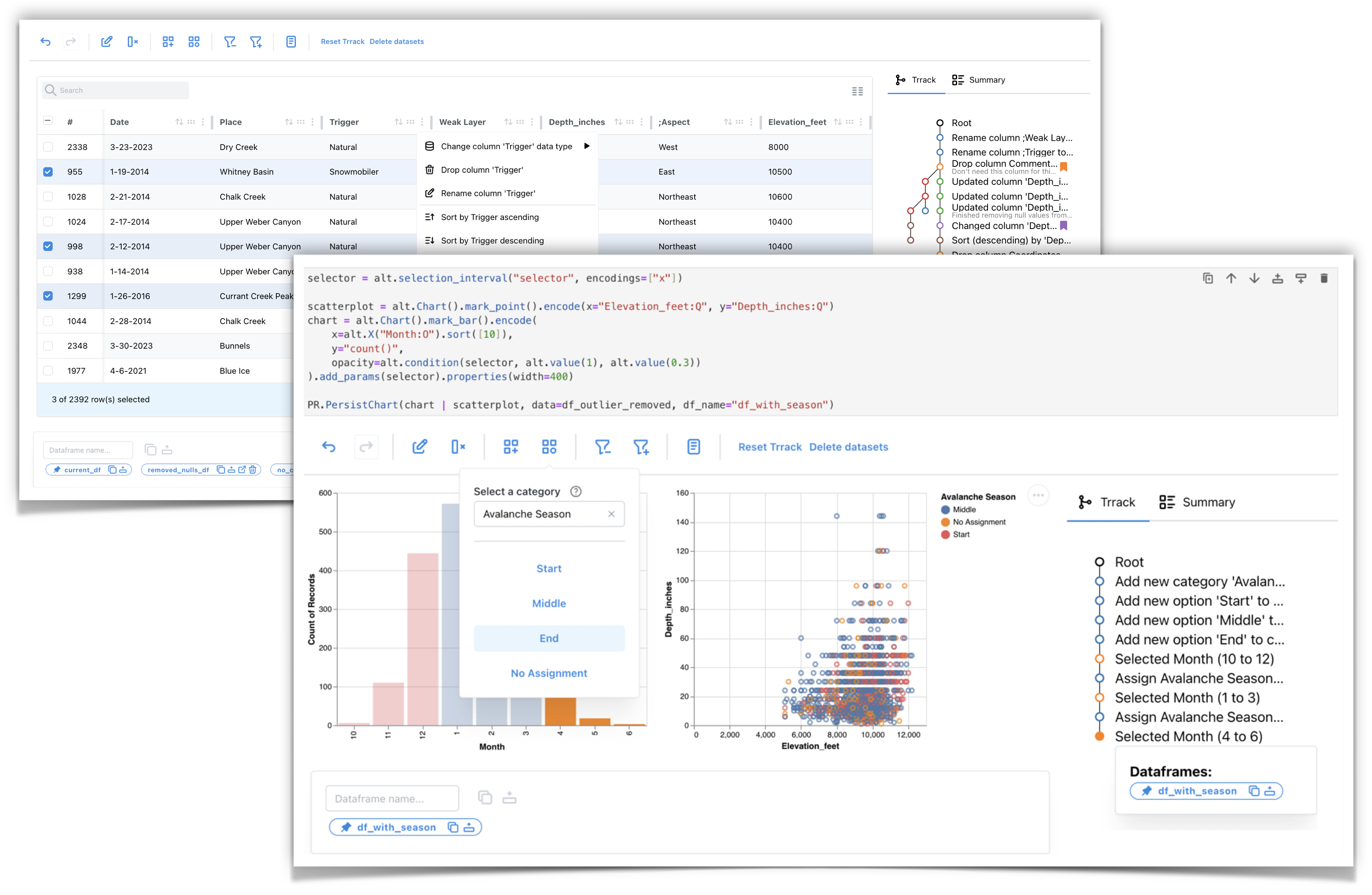
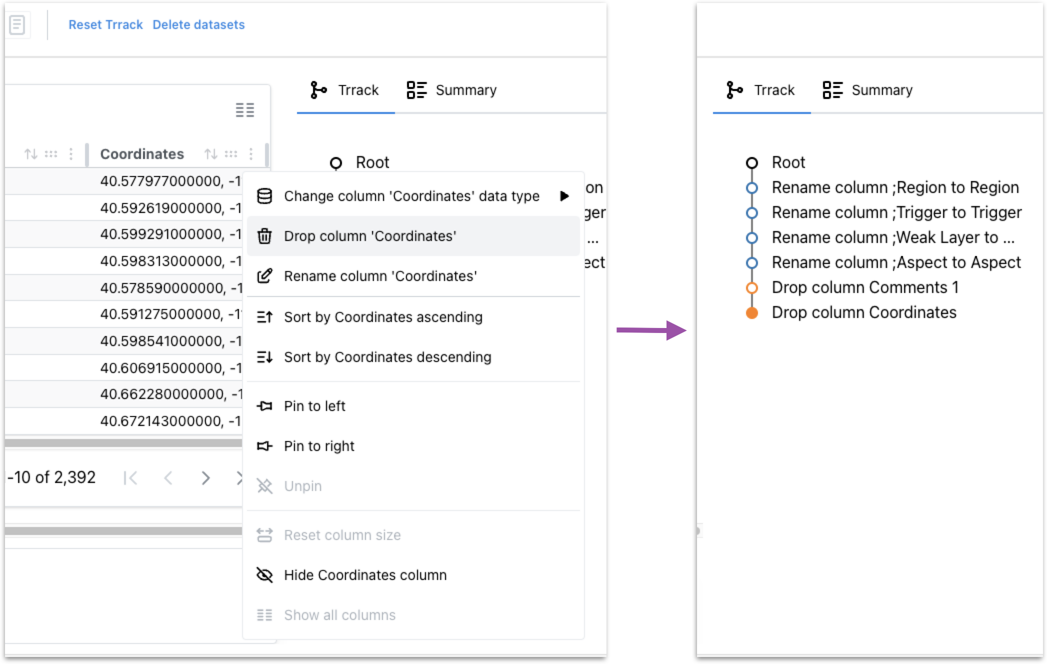
We notice the dataset contains artifacts like leading semicolons in some column names. We can double-click the column header to edit the name and delete the semicolons from all four columns.

All our operations are tracked in a provenance graph on the right side. If we make a mistake, we can click on the previous step and fix it.
Next, we will delete the coordinates and comments columns since we will not perform any location or text-based analysis.
Changing a Column’s Data Type
We can hover over the column headers to see the data type. The Depth_inches column has the data type string instead of float. We want the Depth_inches to be a float column so we can plot it later. We also see that row 7 has a trailing inches symbol, ”, which is the cause of the incorrect data type.
We can use the search box on the top left of the table to find all instances of the trailing symbol. We can double-click the cell to edit it and remove the symbol. Using the menu in the column header, we will change the column’s data type to float.
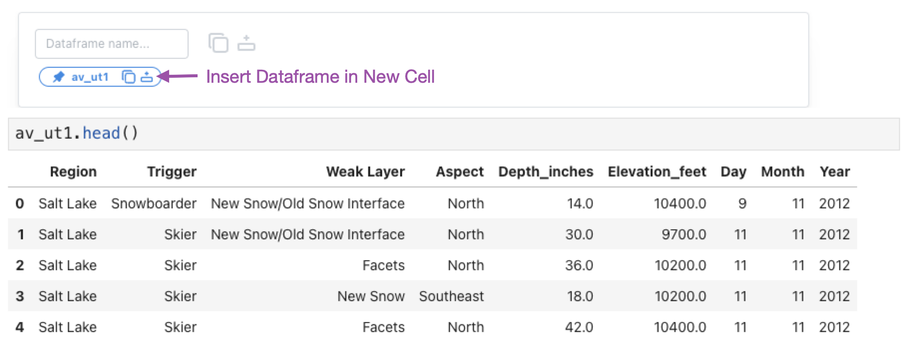
Extracting a Dataframe
We can click the “insert dataframe” button in the dataframe manager at the bottom of the table to insert a cell with a pandas dataframe called av_ut1. This dataframe has the changes we made in the table applied: the column names are corrected, two columns are removed, and the datatype of Depth_inches is numerical.
Equivalent pandas code
For reference, here is the equivalent pandas code for making these changes to the dataframe:
# Remove leading `;` from column names
av_ut1 = av_ut.rename(
    columns={col: col.replace(";", "") for col in av_ut.columns}
)

# Drop two columns
av_ut1 = av_ut1.drop(columns=["Coordinates", "Comments 1"])

# Replace trailing `"` from Depth_inches
av_ut1["Depth_inches"] = av_ut1["Depth_inches"].apply(lambda x: x.replace('"', ''))
# Cast Depth_inches to float
av_ut1["Depth_inches"] = av_ut1["Depth_inches"].astype(float)

av_ut1.head()
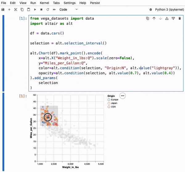
Filtering Data in a Visualization
Next, we look at how to interactively manipulate data in visualizations.
Using the following code, we will create an interactive scatterplot of Elevation_feet vs. Depth_inches using the plot module (basically a shorthand for common vega-altair plots) and our new dataframe.
PR.plot.scatterplot(
        av_ut1,
        x="Elevation_feet:Q",
        y="Depth_inches:Q",
        df_name="av_ut2"
    )
If we look at this plot carefully, we can see that it shows avalanches occurring at elevations outside the possible range for Utah (Utah’s lowest point is at about 2,200 feet; its highest is at 13,528 feet), indicating that these entries are unreliable. We can select these points using a brush and remove them from the dataset.
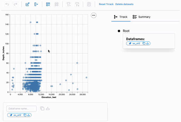
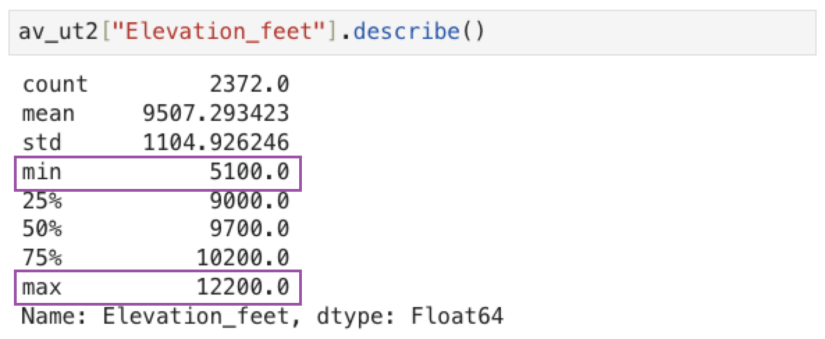
We can again access the resulting dataframe from the dataframe manager. We can also call the describe method on the av_ut2 dataframe to check the min and max of Elevation_feet to verify that the points were removed.
Equivalent pandas code
Again, here’s the equivalent pandas code:
av_ut2 = av_ut1[av_ut1["Elevation_feet"].between(4000, 15000)]
Creating a New Category in a Custom Vega-Altair Chart
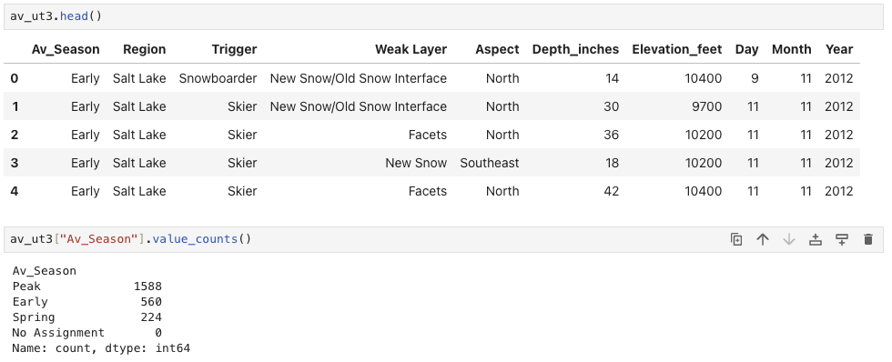
Next, we’ll add a new categorical classification to our dataset: types of avalanche activity vary over the snow season, so we classify the season into three phases: Early, Peak, Spring. Using the following code, we will create a Vega-Altair bar chart with data aggregated by month and make it persistent:
# Create an interval selection param
selection = alt.selection_interval(name="selection", encodings=["x"])

chart = alt.Chart(av_ut2).mark_bar().encode( # Create a barchart for `av_ut2`
    x=alt.X("Month:O").sort([10]), # Encode `Month` on X-axis
    y="count()", # Aggregate records to show `count` for each Month
    opacity=alt.condition(selection, alt.value(1), alt.value(0.2))
).add_params(
    selection
).properties(
    width=500
)

# Wrap VegaAltair chart object with PersistChart to enable persistence
PR.PersistChart(chart, df_name="av_ut3")
We will first create a new category, Av_Season, and add the three options using the new category popup. Next, we interactively select the months and assign them the appropriate phase.
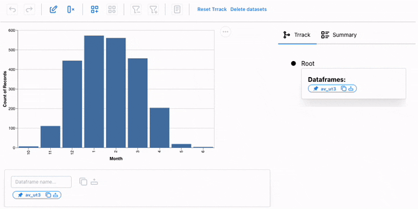
The season is now part of our dataset, and we could facet our dataset based on the season for further analysis.
Equivalent pandas code
The Pandas code to create the new category column and assign appropriate values:
av_ut3 = av_ut2.copy()

# Create a new column and set all values as `End`
av_ut3["Av_Season"] = "End"

# Assign `Start` to records for months 10, 11, 12
av_ut3.loc[av_ut3["Month"] >= 10, "Av_Season"] = "Start"

# Assign `Start` to records for months 10, 11, 12
av_ut3.loc[av_ut3["Month"] <= 3, "Av_Season"] = "Middle"
The Persist Technique
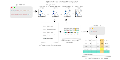
Persist leverages the concept of interaction provenance as a shared abstraction between code and interactions within a notebook. Interaction provenance records all interactions leading to a particular point in the analysis. Each interaction is captured in the output of a code cell and documented in a provenance graph. This graph tracks the interactive analysis in real-time, supports navigation through the history, and allows branching off to explore alternative analysis paths.
Interactions recorded in the provenance graph are translated into data operations, updating the underlying dataframe. This updated dataframe is then used to refresh the output and is available as a new variable for further analysis.
Other Approaches
Persist is not the first attempt to bridge the gap between code and interactive visualizations in notebooks. B2 and Mage are two other notable approaches.
B2 bridges code and interactive visualizations using data queries and selections as shared abstractions between code and interactions. This method injects code into cells to preserve interactions. Mage detects interactions in outputs, maps them to equivalent code using templates, and injects the code into cells.
In contrast, Persist represents interaction provenance as a provenance graph, maintaining a clear separation between code and interactions. Persist applies the actions captured in the provenance graph when the cell is run rather than generating equivalent pandas code and inserting it into the notebook.
What’s Next?
We have released the first version of Persist and would love to hear your feedback and thoughts! Try it out and join our slack team to ask questions or report an issue if you find a problem. You can learn more about Persist in our documentation.
Video
The Paper
This blog post is based on the following paper:
Persist: Persistent and Reusable Interactions in Computational Notebooks
Computer Graphics Forum (EuroVis), 2024