Making Data Visualizations Talk: Accessible Text Descriptions for UpSet Plots
Data visualizations in scientific journals are essential for understanding the content of an article. However, visualizations typically are inaccessible for blind or low-vision users. A common remedy are text descriptions for the visualizations. Yet, text descriptions are difficult to generate for advanced plots, such as UpSet Plots. Here, we introduce methods to generate short and long text descriptions for UpSet Plots.
Scientists love data. In fact, we love data so much that when you open up any journal article, chances are many of the pages are scattered with data visualizations. That is not just because we like pretty pictures (although we do!). Data visualizations are a powerful tool to show trends or patterns in the numbers that may be difficult to explain in words alone.
But what if you can’t see the data visualization?
Most charts are entirely inaccessible to people who are blind or have low vision. These users often rely on screen readers to read the contents on a computer screen aloud. However, those tools usually come up short regarding data visualizations. Instead of describing the chart, they might just say something like “Image of Figure 1.” That leaves the figure caption as the only source of information; yet captions almost never explain what the data is actually showing. Imagine trying to understand a chart with a title and maybe a vague summary. That is the reality for many blind readers.
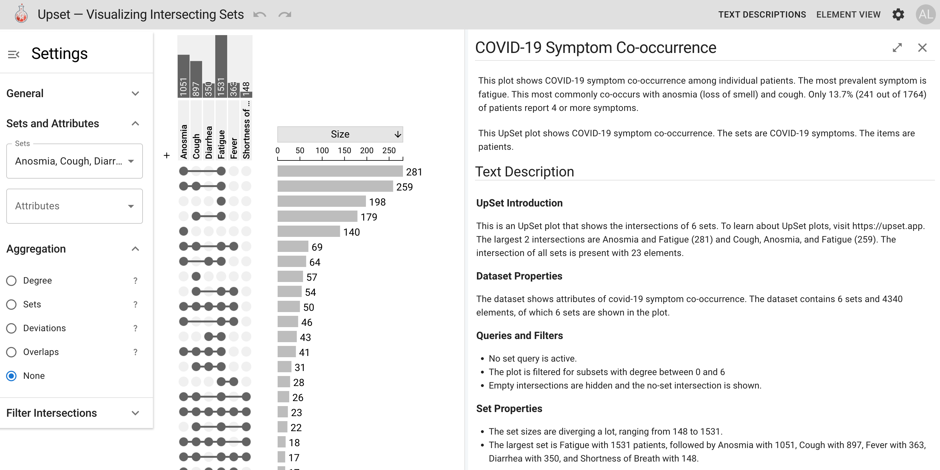
One chart type where this really matters are UpSet plots, shown in the figure above. It is a popular way to visualize how different sets overlap. Think of it as a more organized way to show set overlaps than a traditional Venn diagram. These plots are used across disciplines, especially in computer science, bioinformatics, computational biology… practically any data-heavy field. But UpSet plots are visually complex and nearly impossible to interpret without sight.
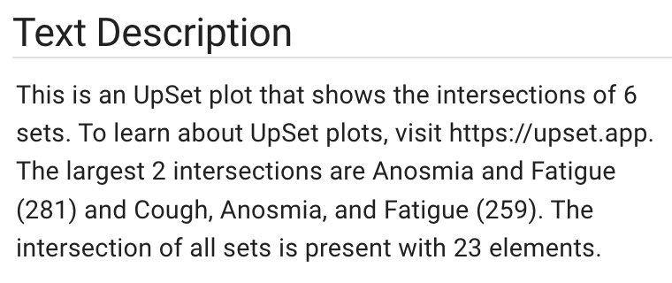
That is where our work comes in. We developed a system that automatically generates screen- reader-accessible text descriptions for UpSet plots. But not just generic summaries like “there are bars and dots.” These descriptions highlight key structural features of the plot, including the largest intersections, distribution of elements, and other patterns typically interpreted visually. The goal is to give screen-reader users meaningful access to the same insights a sighted reader would glean from the visualization. It basically provides the plot with a narrative voice.
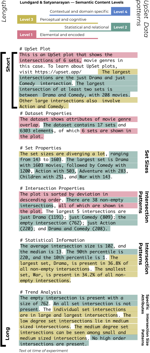
What makes our system unique? This is not just a one-off tool for a specific dataset. We analyzed 80 UpSet plots from published papers and identified recurring data patterns, such as skewed intersection sizes or dominant sets that shaped the narrative focus of our text descriptions. These insights informed a modular, rule-based pipeline that produces both brief summaries and extended descriptions. As shown in the annotated example below, the generated text incorporates multiple layers of information, from basic chart elements to statistical summaries.
But do these text descriptions actually work?
To find out, we conducted in-depth interviews with 11 blind or low-vision screen reader users. And these were not quick usability tests! They were in-depth conversations where participants walked through the descriptions, shared what made sense and what did not, and suggested changes that made the description stronger.
These interviews revealed valuable insights into how experienced screen-reader users navigate complex text. For example, our participants emphasized the importance of structure, recommending using bullet points to help navigate longer descriptions. They also highlighted the need for high-level takeaways before discussing fine-grained details.
After this process, Maggie McCracken, one of the lead authors of our study, realized how powerful participation itself could be. As a psychology researcher, she has worked with many participant groups, but this one stood out for how genuinely enthusiastic they were. They were not just excited about the tool but about the fact that this type of research was happening at all. Several told us they were entirely used to being left out of data visualizations and that being part of the process was meaningful. And that says a lot, considering the data they were reading was about COVID symptoms, which is not exactly edge-of-your-seat material.
So yes, making charts more accessible helps blind readers. But more than that, it improves how we all think about communicating data.
If you are curious, you can try it out for yourself at https://upset.multinet.app. You can also upload your own data and generate descriptions instantly.
This project serves as a reminder that accessibility is not just a technical challenge. It is about asking who gets to be included in scientific conversations. Accessibility is not just a bonus feature but part of that conversation. Charts included.
This work was generously supported by the Chan Zuckerberg Initiative.
The Paper
This blog post is based on the following paper:
Accessible Text Descriptions for UpSet Plots
Computer Graphics Forum (EuroVis), 2025