Quickstart Tutorial
Analysis with Persist
It’s easiest to see how it works by following an analysis. We’ll look at avalanches in the Utah mountains. You can follow along using this binder instance. Binder instance might take a few minutes to start the first time. You can also download the notebook and run the notebook in a local JupyterLab instance. Follow the instructions here to set up local JupyterLab with Persist extension.
The notebook uses VegaAltair to create interactive visualizations and assumes some familiarity with VegaAltair, VegaLite, and the declarative approach to creating visualizations. You can refer to their getting started for a quick introduction. You won’t have to write any VegaAltair code to follow the blog.
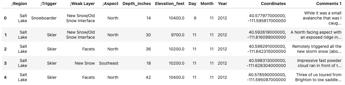
We will load the data in a Pandas dataframe.
import pandas as pd
import altair as alt
import persist_ext as PR # Load the extension
av_ut = pd.read_csv("avalanches_ut.csv") # load the csv
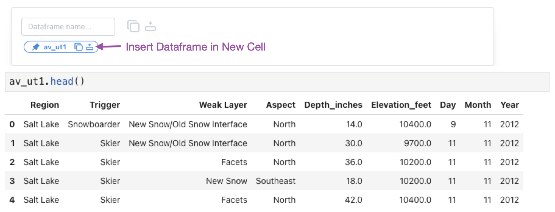
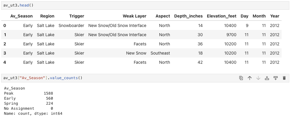
av_ut.head()
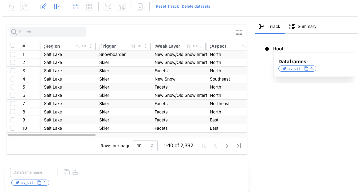
After loading the data, we examine the data in an interactive data table using the following code.
PR.PersistTable(av_ut, df_name="av_ut1")
Working with Columns
We notice the dataset contains artifacts like leading semicolons in some column names. We can double-click the column header to edit the name and delete the semicolons from all four columns.
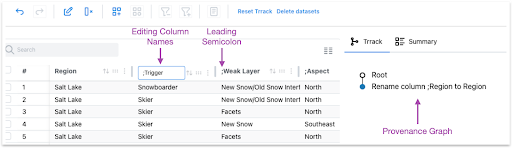
All our operations are tracked in a provenance graph on the right side. If we make a mistake, we can click on the previous step and fix it.
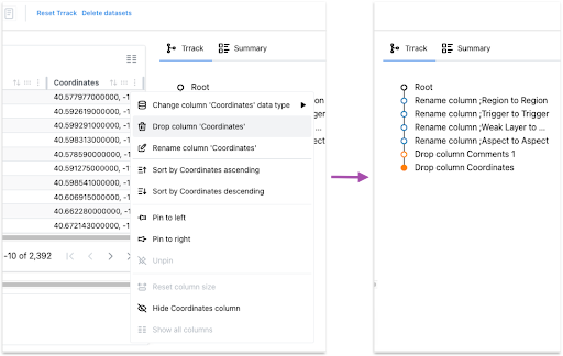
Next, we will delete the coordinates and comments columns since we will not perform any location or text-based analysis.
Changing a Column’s Data Type
We can hover over the column headers to see the data type. The Depth_inches column has the data type string instead of float. We want the Depth_inches to be a float column so we can plot it later. We also see that row 7 has a trailing inches symbol, ”, which is the cause of the incorrect data type.
We can use the search box on the top left of the table to find all instances of the trailing symbol. We can double-click the cell to edit it and remove the symbol. Using the menu in the column header, we will change the column's data type to float.
Extracting a Dataframe
We can click the “insert dataframe” button in the dataframe manager at the bottom of the table to insert a cell with a pandas dataframe called av_ut1. This dataframe has the changes we made in the table applied: the column names are corrected, two columns are removed, and the datatype of Depth_inches is numerical.
Equivalent pandas code
For reference, here is the equivalent pandas code for making these changes to the dataframe:
# Remove leading `;` from column names
av_ut1 = av_ut.rename(
    columns={col: col.replace(";", "") for col in av_ut.columns}
)

# Drop two columns
av_ut1 = av_ut1.drop(columns=["Coordinates", "Comments 1"])

# Replace trailing `"` from Depth_inches
av_ut1["Depth_inches"] = av_ut1["Depth_inches"].apply(lambda x: x.replace('"', ''))
# Cast Depth_inches to float
av_ut1["Depth_inches"] = av_ut1["Depth_inches"].astype(float)

av_ut1.head()
Filtering Data in a Visualization
Next, we take a look at how to interactively manipulate data in visualizations.
Using the following code, we will create an interactive scatterplot of Elevation_feet vs. Depth_inches using the plot module (basically a shorthand for common vega-altair plots) and our new dataframe.
PR.plot.scatterplot(
        av_ut1,
        x="Elevation_feet:Q",
        y="Depth_inches:Q",
        df_name="av_ut2"
    )
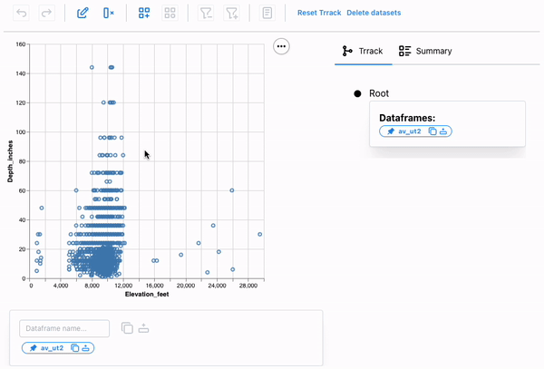
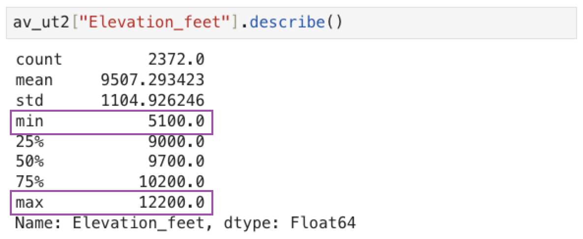
If we look at this plot carefully, we can see that it shows avalanches occurring at elevations outside the possible range for Utah (Utah’s lowest point is at about 2,200 feet; its highest is at 13,528 feet), indicating that these entries are unreliable. We can select these points using a brush and remove them from the dataset.
We can again access the resulting dataframe from the dataframe manager.
Equivalent pandas code
Again, here’s the equivalent pandas code:
av_ut2 = av_ut1[av_ut1["Elevation_feet"].between(4000, 15000)]
Creating a New Category in a Custom Vega-Altair Chart
Next, we’ll add a new categorical classification to our dataset: types of avalanche activity vary over the snow season, so we classify the season into three phases: Early, Peak, Spring. Using the following code, we will create a Vega-Altair bar chart with data aggregated by month and make it persistent:
# Create an interval selection param
selection = alt.selection_interval(name="selection", encodings=["x"])

chart = alt.Chart(av_ut2).mark_bar().encode( # Create a barchart for `av_ut2`
    x=alt.X("Month:O").sort([10]), # Encode `Month` on X-axis
    y="count()", # Aggregate records to show `count` for each Month
    opacity=alt.condition(selection, alt.value(1), alt.value(0.2))
).add_params(
    selection
).properties(
    width=500
)

# Wrap VegaAltair chart object with PersistChart to enable persistence
PR.PersistChart(chart, df_name="av_ut3")
We will first create a new category, Av_Season, and add the three options using the new category popup. Next, we interactively select the months and assign them the appropriate phase.
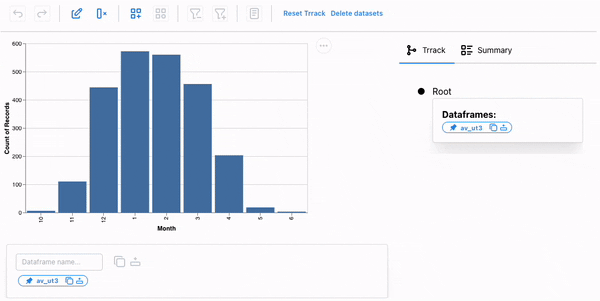
Notice that the season is now part of our dataset, and we could facet our dataset based on the season for further analysis.
Equivalent pandas code
av_ut3 = av_ut2.copy()

# Create a new column and set all values as `End`
av_ut3["Av_Season"] = "End"

# Assign `Start` to records for months 10, 11, 12
av_ut3.loc[av_ut3["Month"] >= 10, "Av_Season"] = "Start"

# Assign `Start` to records for months 10, 11, 12
av_ut3.loc[av_ut3["Month"] <= 3, "Av_Season"] = "Middle"
The Persist Technique
Persist leverages the concept of interaction provenance as a shared abstraction between code and interactions within a notebook. Interaction provenance records all interactions leading to a particular point in the analysis. Each interaction is captured in the output of a code cell and documented in a provenance graph. This graph tracks the interactive analysis in real-time, supports navigation through the history, and allows branching off to explore alternative analysis paths.
Interactions recorded in the provenance graph are translated into data operations, updating the underlying dataframe. This updated dataframe is then used to refresh the output and is available as a new variable for further analysis.
Caveats on using Vega-Altair and Persist
Persist works with Vega-Altair charts directly for the most part. Vega-Altair and Vega-Lite offer multiple ways to write a specification. However, Persist has certain requirements that need to be fulfilled.
-
The selection parameters in the chart should be named. Vega-Altair's default behavior is to generate a name of the selection parameter with an auto-incremented numeric suffix. The value of the generated selection parameter keeps incrementing on subsequent re-executions of the cell. Persist relies on consistent names to replay the interactions, and passing the name parameter fixes allows Persist to work reliably.
-
The point selections should have at least the field attribute specified. Vega-Altair supports selections without fields by using auto-generated indices to define them. The indices are generated in the source dataset in the default order of rows. Using the indices directly for selection can cause Persist to operate on incorrect rows if the source dataset order changes.
-
Dealing with datetime in Pandas is challenging. To standardize the way datetime conversion takes place within VegaLite and Pandas when using Vega-Altair, the TimeUnit transforms, and encodings must be specified in UTC. e.g
month(Date)should beutcmonth(Date).