Adding Plots
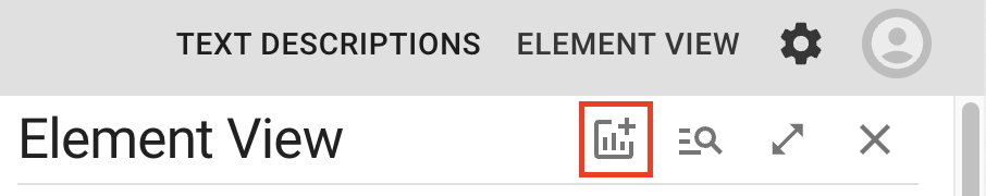
By default, you'll see a bar chart for each numeric attribute in your dataset. However, you can add as many plots to the sidebar as you'd like. To add a plot, click the Add Plot button to open the add plot dialog:
Within this dialog, the 3 tabs on the top allow you to choose which type of plot you'd like to add:
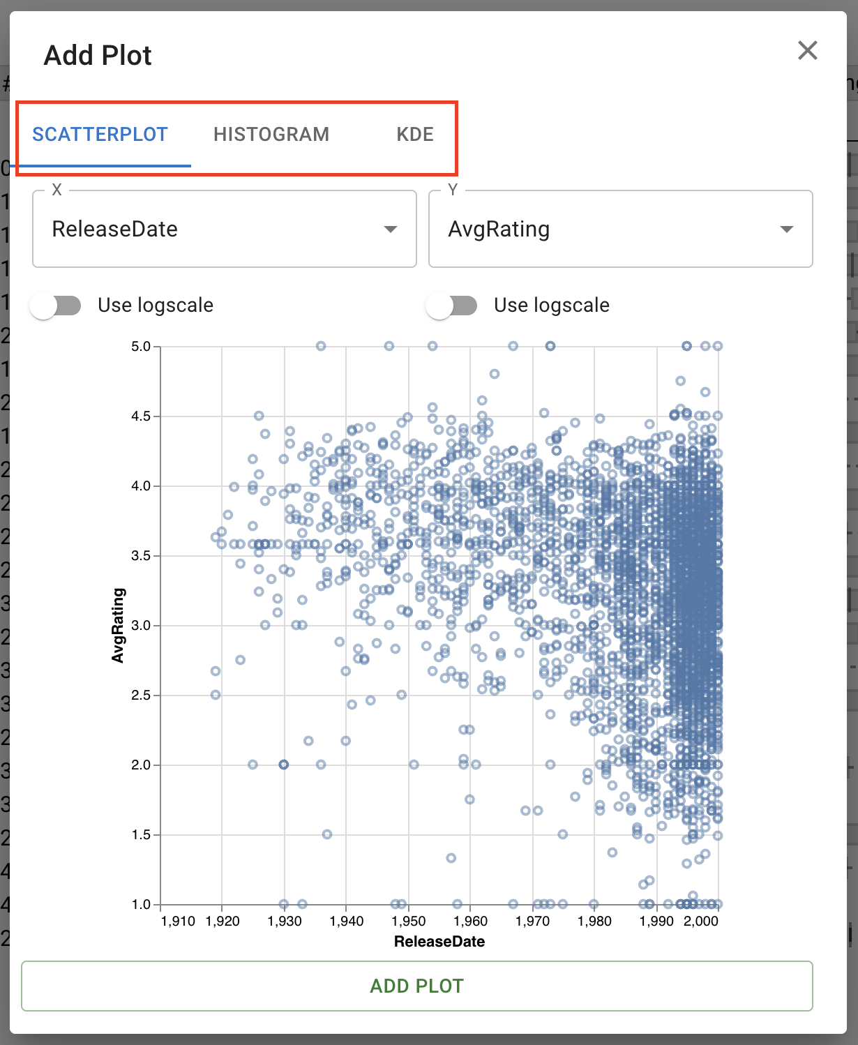
For details on each plot type, see: Scatterplot, Histogram, and KDE.
Adding a Scatterplot
Within the scatterplot tab, you have options to set the X and Y axis of the scatterplot:
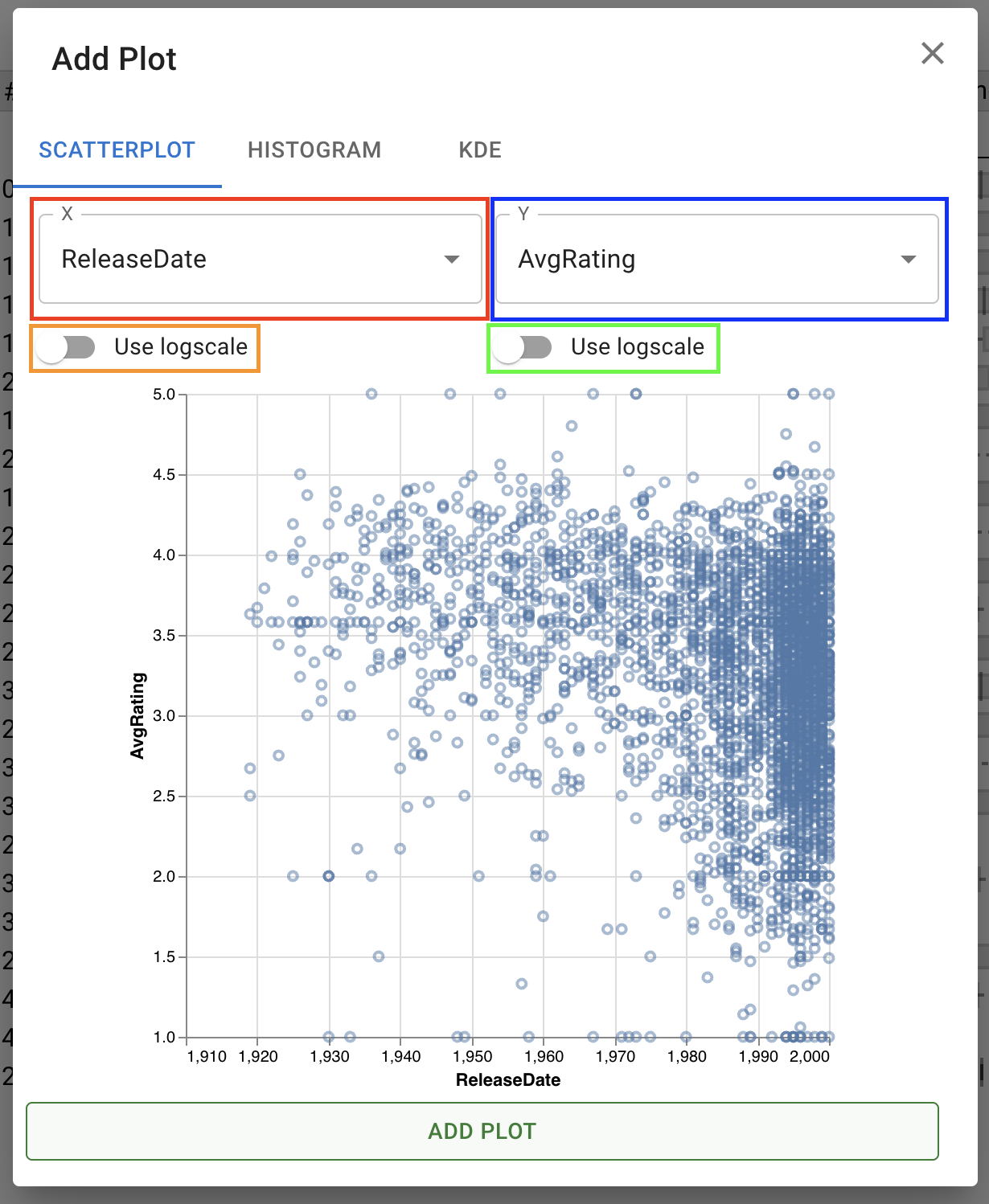
The X dropdown, boxed in red, sets the attribute to be used for the X axis of the chart. The Use logscale toggle underneath this, boxed in orange, activates logarithmic scale for the x axis and its attribute. The Y dropdown (blue) and its Use logscale toggle (green) function in exactly the same way, setting the attribute to use for the Y axis and toggling between a linear and logarithmic scale.
Adding a Histogram
Within the histogram tab, you have options to set the X axis and the bin count of the histogram:
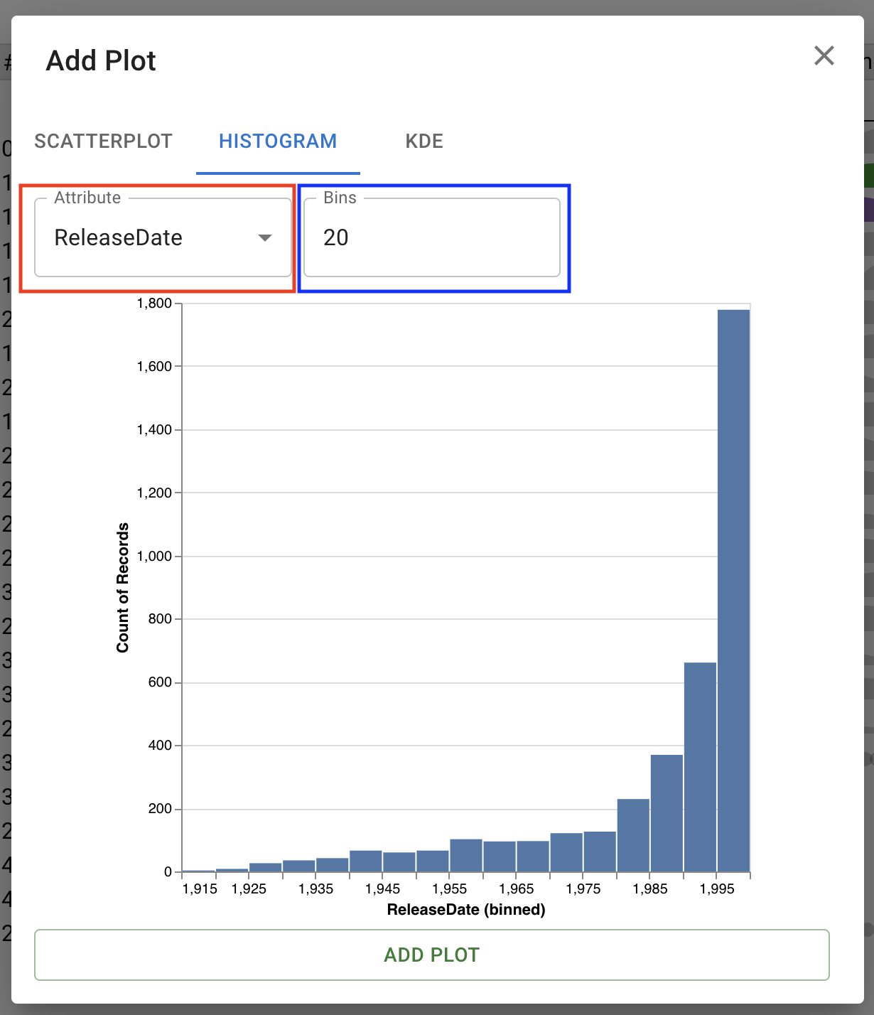
The Attribute dropdown, in red, sets the attribute to visualize along the X axis of the histogram. The bin count, in blue, sets the number of bins (bars) to show in the resulting plot.
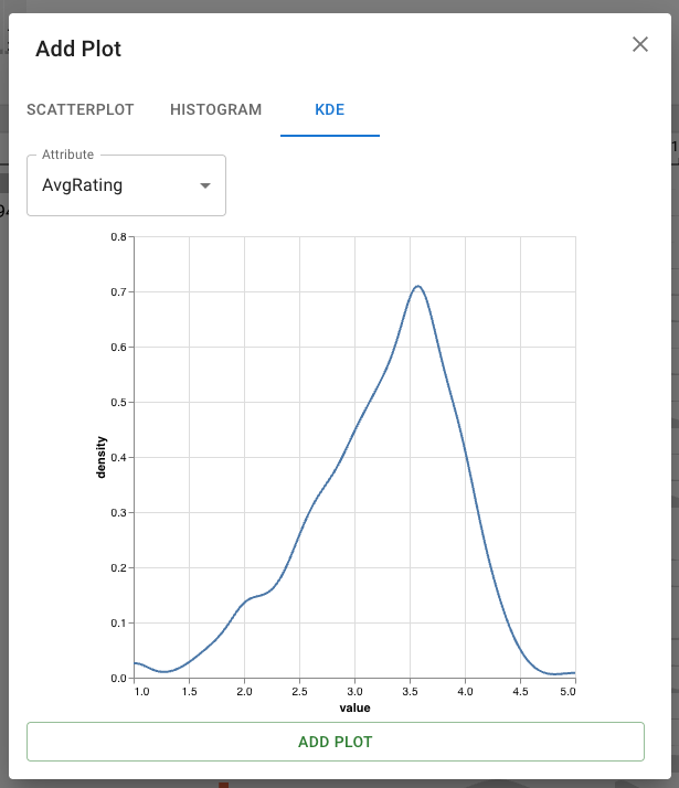
Adding a Kernel Density Estimate (KDE) Plot
Within the KDE tab, you can add a Kernel Density Estimate plot. The single dropdown controls the attribute visualized in the KDE.