Scatterplot
Scatterplots plot all elements in the visible intersections along two user-defined attribute axis. Each (x, y) point represents an element which has a value of x for the attribute plotted on the x-axis and a value of y for the attribute plotted on the y-axis.
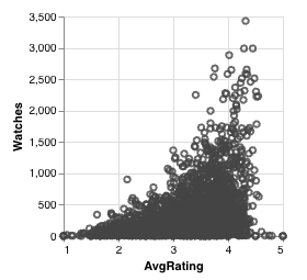
This allows you to see how attributes correlate in the dataset. For example, this scatterplot shows some correlation between watch count and average rating on a dataset of movies. The watch count generally increases with the average rating until watches dramatically decrease for movies rated >4.5.
Colored Points
If the intersection that a point belongs to is bookmarked or selected, it takes on the intersection's color. Points not in a selected or bookmarked intersection remain the default grey color.
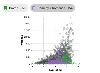
In this example, the Drama intersection is bookmarked and the Comedy & Romance intersection is selected. Drama is much larger, so you see more points colored green, with a smaller number of purple points from Drama in the foreground.
Translucent Points
When an intersection is selected, all points not in the selected intersection become translucent, while the points from the selected intersection remain opaque (in addition to gaining the color of the intersection).
Point Z Ordering
When points overlap, points from the selected intersection are ordered on top (fully visible), then points from bookmarked intersections in the middle, then all other points. In other words, selected points are never obscured and bookmarked points cannot be obscured by unbookmarked points (but may be by selected or other bookmarked points).
Selections
Graphical selections can also affect the color, opacity, and ordering of points; see Scatterplot Selection. Element queries do not affect element view plots.