• HOME
  • TEAM
  • PUBLICATIONS
  • BLOG
  • CULTURE
  • POSITIONS
Reading Between the Lines: The US Computer Science Graduate Admission Process 9 Apr 2025
Blog lead image

It’s the time of the year that prospective graduate students have to commit to a particular computer science graduate program. Those that got multiple offers are in the envious position to be able to choose between different programs, weighing potential advisors and schools. But the admission process can be opaque for students. Here, I’ll share some details in the form...

Reflections on UpSet 16 Oct 2024
Blog lead image

This blog post was triggered by UpSet winning the 10-year Test of Time Award at IEEE VIS. In this post, I reflect on how UpSet came about, and what made it successful.

Lessons Learned from Visualizing Multimodal Data... with Aardvarks... 30 Sep 2024
Blog lead image

How do you analyze data with multiple modalities – say, images, trees and time-series? If you ask a visualization researcher, we will tell you visualizations are the solution, specifically composite visualizations! This blog shares some lessons we learned designing and developing composite visualizations to help understand cancer cell development. Regarding the aardvarks... this is clickbait, mostly. But we did get a...

reVISit: Taking Control of Your Online Studies! 20 Jun 2024
Blog lead image

Today we’re announcing the release of reVISit version 1.0, our open platform for designing, debugging, publishing, and disseminating your online visualization user studies!

Persist — A JupyterLab Extension for Persistent Interactions 29 May 2024
Blog lead image

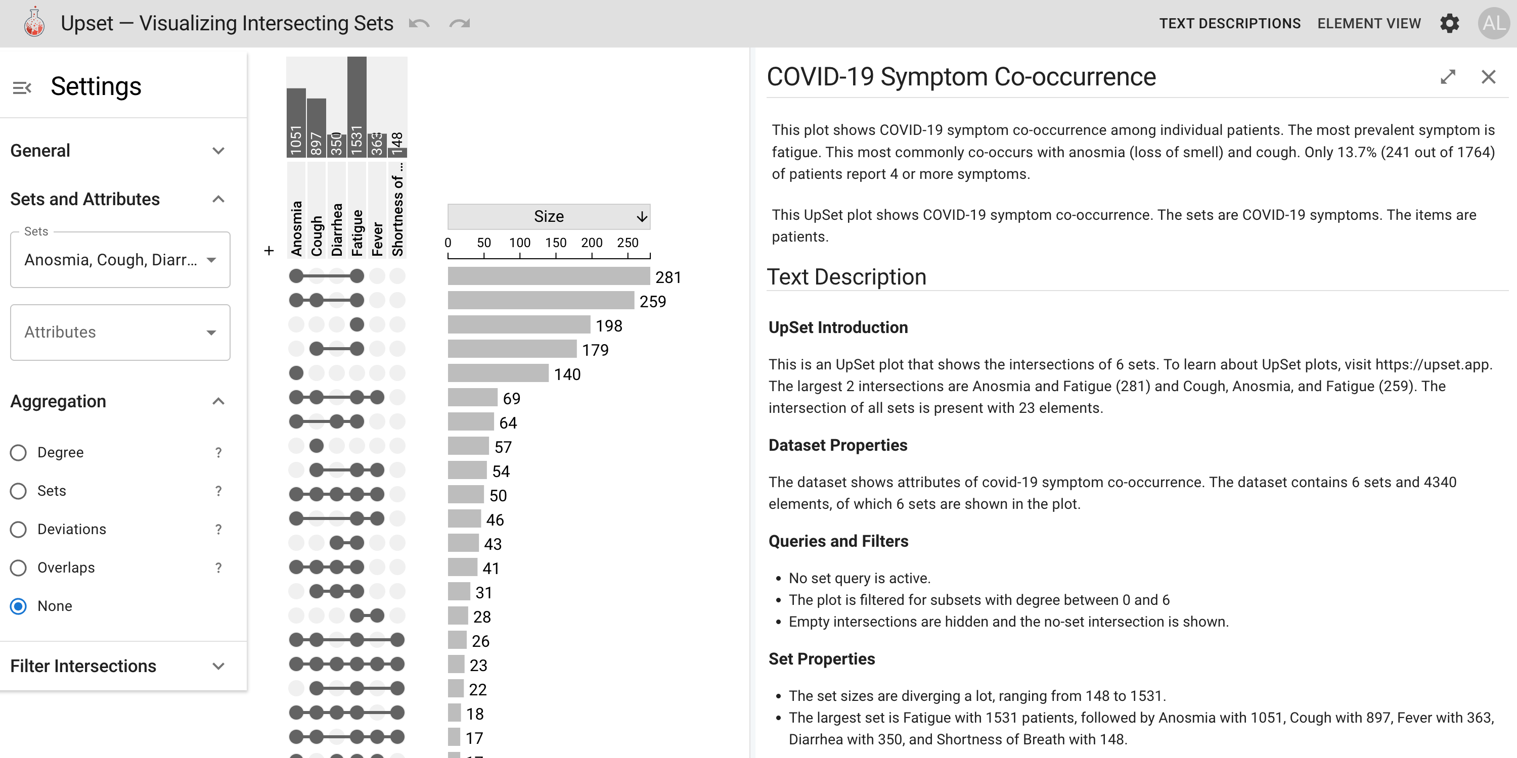
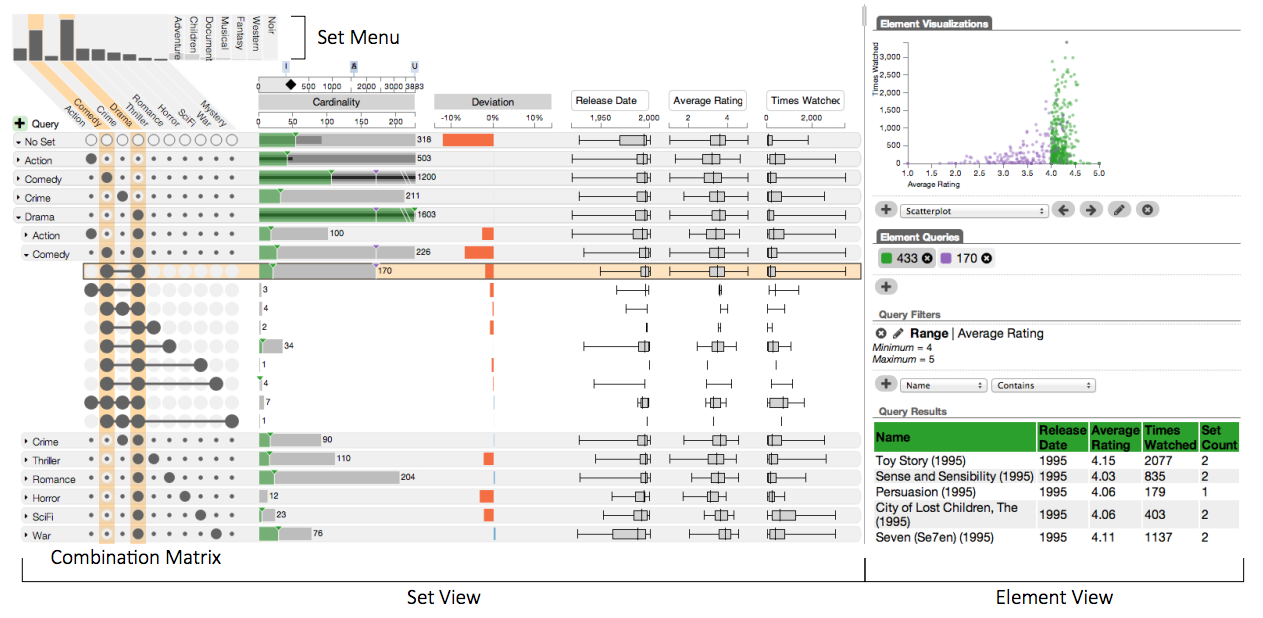
Computational notebooks like JupyterLab have become indispensable tools, enabling seamless integration of code, visualizations, and text. However, modern notebooks limit the usefulness of interactions in visualizations in two significant ways. First, the results of interactions in visualizations cannot be accessed in code. For example, a filter applied in a visualization cannot be applied directly to the data in the notebook....

Ferret — Catching Scientific Fraud with Data Visualizations 15 Sep 2023
Blog lead image

Ferrets search data
Alas, artifacts abound
Manipulation

How People Actually Lie With Charts 17 Apr 2023
Blog lead image

Online audiences and visualization researchers often share, discuss, and critique misleading visualizations. Existing critiques typically point out suboptimal choice of visual encoding or violations of common design guidelines. But is this how charts are used to deceive audiences and spread misinformation in practice? This blog post discusses the findings from our paper on misleading visualizations.

Reusing Operations In Interactive Visualizations and Computational Notebooks 3 Jan 2023
Blog lead image

Interactive data analysis leverages human perception to enable various analysis tasks; however, a prior analysis can rarely be used when the dataset updates or is transferred to a different analysis environment, like a computational notebook. In this post, we discuss how we can capture reusable interactive workflows.

Can We Guess Why you Selected Something in a Scatterplot? 28 Oct 2022
Blog lead image

Selections are a key interaction in data visualization. They are used for highlighting and as the starting point for subsequent actions, including filters, group assignments, etc. Capturing the intent – WHY were these items selected? – can be used to help users refine their selections and to keep a meaningful history of the analysis process. This post discusses our paper...

Data Hunches – Recording and Communicating Personal Knowledge in Visualizations 11 Oct 2022
Blog lead image

Have you ever looked at data visualization and thought: that doesn't look right. Maybe you knew more about the data than is actually contained in the dataset. Did you then remember that hunch throughout your data analysis process, impacting your judgment and interpretation of the data? That thought, whether you were aware of it or not, possibly impacted your interpretation....

Loon – Finding the Right Cancer Drug with Microscopy and Visualization OR How to use Exemplars to Effectively Browse Large Complex Data Sources 27 Apr 2022
Blog lead image

In this blog post, we want to tell two stories: First, we want to explore how visualization can be used to select cancer treatments. And second, we want to tell a more technical story of how you can use exemplars to deal with large datasets that you can’t easily summarize.

Wait... I never signed up to be an economist 8 Dec 2021
Blog lead image

Conducting user studies to evaluate visualizations is a popular approach for evaluation. During the pandemic such user studies have migrated to crowdsourced platforms due to restrictions on in-person studies. Do we pay the participants in our studies fairly? Is it our job to do so? Our panel at IEEE VIS 2021, explored the above questions and many more.

Presenting in the time of COVID 1 Oct 2021
Blog lead image

Is recording a conference talk really any easier than giving one?

Manifesto for Putting "Chartjunk" in the Trash 2021! 19 Sep 2021
Blog lead image

As a research community, we have been using the imprecise term “chartjunk” in situations where other words would be a more precise, and kinder fit. In our manifesto, part of the alt.vis workshop at IEEE VIS 2021, we blur the boundaries between performance art, maintenance, and research as our first steps of putting chartjunk in the trash.

What you Can do in College to get into a CS PhD Program 21 Nov 2020
Blog lead image

Are you considering grad school? Here are a few steps you can take to maximize your chances. The bad news is that it’s best to start planning and working towards getting into grad school early: I recommend you take first steps some time at the end of your sophomore year in college. The good news is that the process is...

What we Should and Shouldn’t Change About the VIS Review Process 3 Nov 2020
Blog lead image

The review process at IEEE VIS hasn’t changed in the last decade. Here I lay out some suggestions to make the process more equitable, open, and to possibly raise the quality of reviews.

The Interpretivist Lens – What Design Study as a Method of Inquiry Can Teach Us. 30 Oct 2020
Blog lead image

Much of the current conducting and reporting on design studies leaves little room for contributions outside of the end tool or technique. An interpretivist approach embraces the messy, subjective nature of design studies and emphasizes the ways in which we can conduct research of this nature with rigor. In this post, we advocate for interpretivist design studies and give three...

Introducing Trrack – A Library for Tracking Provenance on the Web 28 Oct 2020
Blog lead image

Tracking a history of actions of an interactive visual analysis session (i.e., its provenance) has benefits ranging from simple undo/redo, to enabling reproducibility, to making post-hoc analysis of user sessions possible. However, there are no established provenance tracking libraries that visualization developers can use with their web-based tools. This blog post introduces Trrack – a web-based library designed for easy...

How Far Can We Push Crowdsourced Evaluation of Visualization Techniques? 23 Jul 2020
Blog lead image

Crowdsourcing is a popular method for conducting quantitative studies, yet up to now, the types of studies that were run on crowdsourcing platforms is narrow. In this blog post, we describe a method to evaluate complex visualization techniques in a crowdsourced setting, which we developed for a 2020 CHI paper on evaluating multivariate network visualization techniques.

State COVID-19 Dashboards 20 Jul 2020
Blog lead image

tldr: As states are navigating the influx of COVID data, they are using dashboards to communicate with their constituents. Although many states are doing a good job at collecting and sharing data in open data portals, dashboard quality varies a lot across states, and some have considerable room for improvement.

The Case Against Dashboards (when Visualizing a Pandemic) 6 Jul 2020
Blog lead image

tldr: Using dashboards comes with risks: they leave out critical context by over-simplifying and hence give false certainty. A more nuanced approach including interpreation by experts, and showing multiple perspectives is needed when visualizing data for something as complex as the COVID-19 pandemic.

Introducing the VDL Blog 6 Jul 2020

tldr: We're starting a blog to communicate about our research and share our thoughts on data visualization!

  • Email
  • Twitter
  • YouTube
  • GitHub
  • Photos

The visualization design lab is part of

  • https://www.sci.utah.edu/
  • https://www.cs.utah.edu/

Copyright © 2016-2025 The Visualization Design Lab. All content on this website is licensed under the Creative Commons Attribution license (CC BY).
Copyright or exclusive license of the linked publications is frequently with the publishers. Logo by Antarctic Design. Last updated on May 20, 2025